PICAFlow: Pipeline for Integrative and Comprehensive Analysis of flow/mass cytometry data
Warning: this tutorial is only available in English, even if you choose the French language at the bottom of the screen. Thank you for your understanding.
PICAFlow is a R package allowing to process cytometry data from raw FCS files to deep and comprehensive analysis of underlying key messages.

PICAFlow could be in real life. Drawn by Craiyon.Table of contents
- Prerequisites
- Pre-processing
- Transformation and compensation
- Normalization
- Gating
- Downsample, rescale and split data
- UMAP dimensionality reduction
- Export FCS files
- Clustering
- Metadata integration and analysis
- Parameters export
- Acknowledgements
- Citation
1) Prerequisites
1.1) PICAFlow R package installation
PICAFlow package can be installed with the following commands:
# The following line can be skipped if the devtools package is already installed

install.packages("devtools")

# Load the devtools package

library("devtools")

# Install/update PICAFlow from GitHub repository

devtools::install_github("PaulRegnier/PICAFlow", force = TRUE)
1.2) Troubleshooting
In the case the installation of PICAFlow is not successful, please check the following points:
- If you run R under the Windows operating system, do you have the
Rtoolsutility correctly installed and in the right compatible version?- Please visit this link to get more information about
Rtoolsand install it
- Please visit this link to get more information about
- Do you have a working version of the
Gitutility installed on your operating system?- Please visit this link to get more information about
Gitand install it
- Please visit this link to get more information about
- Do you have a working version of the
devtoolsR package installed on your computer?- If you do not know, run the following command to force the (re)installation of
devtools:
- If you do not know, run the following command to force the (re)installation of
install.packages("devtools", force = TRUE)
- If any of the above do not help, you can consider to manually install the packages that are not hosted directly on the CRAN servers:
# Install packages that are mandatory:

install.packages("BiocManager", force = TRUE)
install.packages("remotes", force = TRUE)

# Install packages hosted by the Bioconductor repository:

BiocManager::install("Biobase", force = TRUE)
BiocManager::install("flowCore", force = TRUE)
BiocManager::install("flowWorkspace", force = TRUE)
BiocManager::install("flowStats", force = TRUE)
BiocManager::install("ggcyto", force = TRUE)
BiocManager::install("flowGate", force = TRUE)
BiocManager::install("FlowSOM", force = TRUE)

# Finally, try to install PICAFlow:

devtools::install_github("PaulRegnier/PICAFlow", force = TRUE)
Note: in some rare cases, even after the troubleshooting maneuvers, the installation of PICAFlow could still fail, notably if users already have the flowWorkspace package installed. To overcome this problem, users should manually remove the flowWorkspace folder in their R library, then proceed with the reinstallation of this package alone, following the previously given R command regarding this specific package.
Due to the fact that some users could be affected by a persistent error related to the FastPG package during PICAFlow installation under recent MacOS versions, the FastPG package was moved from the Imports to the Suggests list in the DESCRIPTION file of PICAFlow. This means that the FastPG package is now not installed by default and is only loaded when needed. This will allow MacOS users to correctly install and use PICAFlow if FastPG installation is persistently failing. Of note, if the FastPG package is not installed, then the associated FastPG/PhenoGraph clustering method will not be available. The following command will launch the installation process of the FastPG package:
# After installing Git on your system, proceed with the installation of a GitHub-hosted package through the Bioconductor installation function:

devtools::install_github("sararselitsky/FastPG", force = TRUE)
1.3) Load PICAFlow
To load PICAFlow, simply enter the following command in the R console:
library("PICAFlow")1.4) Update PICAFlow
Upon loading, PICAFlow checks online if there is a newer version of the package. If PICAFlow notifies you of an update, we highly recommend you to update as soon as possible, in order to benefit from the latest functionalities and fixes.
To update PICAFlow, simply enter the following command in the R console:
devtools::install_github("PaulRegnier/PICAFlow", force = TRUE)If the installation fails or if the update message keeps displaying after the update, try providing the tag corresponding to the version you want to install:
devtools::install_github("PaulRegnier/[email protected]", force = TRUE) # Where x.x.x represents the version number to installYou can have access to the latest version number by going directly on the GitHub releases page.
If you still see the update message, please remove the PICAFlow package from its installation path and reinstall it from scratch using the aforementioned command.
1.5) Example dataset
For learning and test purposes, PICAFlow includes a dataset composed of 25 FCS files pre-processed using FlowJo version 10.1. These FCS files were obtained after the antibody staining of thawed peripheral blood mononuclear cells (PBMCs) previously isolated from human whole blood. The dataset includes 5 healthy donors (labelled as HD), 5 patients with Sjögren’s syndrome (labelled as Sjogren), 5 patients with cryoglobulinemia (labelled as Cryo), 5 patients with Systemic Lupus Erythematosus (labelled as SLE) and 5 patients with Rheumatoid Arthritis (labelled as RA).
You can download two distinct versions of the test dataset: either the raw FCS files version (roughly 2.2GB) or the already pre-processed FCS version (roughly 1.1GB, please see below for further explanation of the pre-processing steps that were performed).
The staining panel (primarily designed to target and study the B cells compartment) consisted of the following antibodies, which was then revealed using a BD LSR Fortessa flow cytometer:
- Anti-FcRL5 coupled with APC fluorochrome
- Anti-CD24 coupled with APC-Cy7 fluorochrome
- Anti-CD38 coupled with Alexa Fluor 700 fluorochrome
- Anti-CXCR5 coupled with BV421 fluorochrome
- Anti-IgD coupled with BV510 fluorochrome
- Anti-CD19 couled with BV605 fluorochrome
- Anti-G6 coupled with BV650 fluorochrome
- Anti-FcRL3 coupled with BV711 fluorochrome
- Anti-CD27 coupled with BV786 fluorochrome
- Anti-CD95 coupled with FITC fluorochrome
- Anti-IgM coupled with PE fluorochrome
- Anti-CD11c coupled with PE-Cy5 fluorochrome
- Anti-Tbet coupled with PE-Cy5.5 fluorochrome
- Anti-CD21 coupled with PE-Cy7 fluorochrome
- Anti-CD3 coupled with PE-TexasRed fluorochrome
The pre-processing of the raw FCS data included the following steps:
- Adjustment of the compensation matrix
- Renaming of the samples to follow the required
CustomPanelName_Group-SampleGroup_Sample-SampleNameformat - Exclusion of non lymphocyte-shaped and doublet cells
Importantly, all figures that are shown in this tutorial actually refer to the raw FCS files.
Please note that to use the full capacities of PICAFlow, every FCS file should be renamed following the aforementioned CustomPanelName_Group-SampleGroup_Sample-SampleName format (example: PanelBCells_Group-HealthyControl_Sample-PatientXY). If this is not the case, please use the file.rename() function in R to format the file names appropriately.
2) Pre-processing
2.1) Working directory setup
PICAFlow is designed to work in a self-organized set of directories, which can be created by running the following commands:
# Define the working directory path

workingDirectory = file.path("C:", "Users", "Paul", "Lab", "R", "PICAFlow")
setwd(workingDirectory)

# Defining a global seed (used in later parts of the tutorial to ensure reproducibility)

seed_value = 42

# Create the actual working directory tree

setupWorkingDirectory()
The setupWorkingDirectory() function creates the following directories tree in the workingDirectory path:
- input
- output
- 1_Transformation
- 2_Normalization
- 3_Gating
- 4_Downsampling
- 5_UMAP
- 6_FCS
- 7_Clustering
- 8_Analysis
- rds
input directory will contain FCS files that you want to analyze. output directory will contain the different parts of the analysis process, organized in several subdirectories. rds directory will contain intermediate versions of FCS files generated during the first steps of their processing.
2.2) Convert FCS files to rds data files
The very first step of the workflow consists to convert each FCS file from the input directory to an associated rds file. Each rds file actually contains a single FlowFrame object (from flowCore package). This step helps to improve the speed and efficiency of the subsequent processing steps:
# Here, we do not need to use a conversion table

parametersConversionTable = NULL

# Convert all FCS files to FlowFrames contained in rds files

totalParametersList = convertToRDS(
    conversionTable = parametersConversionTable
)

totalParametersList

   Parameter_ID    Parameter_Name Parameter_Description
1             1              Time  Empty Description #1
2             2             FSC-A  Empty Description #2
3             3             FSC-H  Empty Description #3
4             4             FSC-W  Empty Description #4
5             5             SSC-A  Empty Description #5
6             6             SSC-H  Empty Description #6
7             7             SSC-W  Empty Description #7
8             8    PE-Texas Red-A                   CD3
9             9           BV605-A                  CD19
10           10           BV786-A                  CD27
11           11          PE-Cy7-A                  CD21
12           12            FITC-A                  CD95
13           13          PE-Cy5-A                 CD11c
14           14           BV421-A                 CXCR5
15           15        PE-Cy5_5-A                  Tbet
16           16           BV711-A                 FCRL3
17           17             APC-A                 FCRL5
18           18           BV650-A                    G6
19           19         APC-Cy7-A                  CD24
20           20 Alexa Fluor 700-A                  CD38
21           21           BV510-A                   IgD
22           22              PE-A                   IgM
The convertToRDS() function, thanks to the conversionTable argument, allows to convert some (or all) parameter names from a value to another, if needed. It also allows to delete one or more channels from the dataset (please use with caution). This is typically used when samples are labelled using two different panels (for instance in different batches) showing the same antibodies specificites but different fluorophores/metal labelling (and vice versa). Please see the ?convertToRDS documentation for more information.
This function also returns a list (named totalParametersList here) of all the parameters present within the dataset, after eventual renaming, which is useful to select which parameters to keep or not.
Depending on the metadata quality of the dataset to analyze, and especially the exact matches between the acquired channels for all the samples, it is possible that users may need to reexport new FCS files to correct these problems. Please be aware that some third-party software (like FlowJo for instance) seem to reorder cytometry channels in newly exported FCS files as compared to FCS files from the same experiment which were not processed by FlowJo. This behaviour can make processed FCS files impossible to integrate with the other non-processed ones. In this case, remember to equally process the FCS files with such software to avoid any potential mismatch. In all cases, the content of the subsequent totalParametersList variable will helps users to identify what failed (both for channels and descriptions) and provide clues on how to correct it if necessary.
2.3) Pre-gating (optional)
One of the very first steps when analyzing cytometry data is to gate on cells of interest, usually lymphocytes, using notably FSC and SSC parameters, but also to remove dead cells and doublets. This can be achieved in PICAFlow with the steps detailed below.
Note: This section is totally optional, as users can directly load pre-gated FCS files within the PICAFlow workflow.
Note 2: This section is only relevant for flow cytometry data, even if it can be applied on mass cytometry data if desired.
2.3.1) Merge samples
First, we have to create a new rds file which will contain the merged individual samples:
totalFlowset = mergeSamples(
    suffix = NULL,
    useStructureFromReferenceSample = 1
)
The useStructureFromReferenceSample argument is used to eventually use a given sample as a structure and parameter name/description reference. This is typically used when channels do not exactly match (notably regarding their acquisition order) despite the fact that the same panel was used and acquired on the same cytometer.
2.3.2) Gate cells
Even if complete on its own, this subsection can be seen as a slightly simplified version of the section number 5 which is totally dedicated to gating. Feel free to read it if you want more information or details.
Actually, the principle is simple, even if it needs a lot of variables to be defined. Concretely, the gateData() function needs some arguments to be specified in order to correctly create, compute and apply the desired gate:
gateName_valuecontains the user-friendly name of the current gatexParameter_valuecontains the parameter name to be used on the x axisyParameter_valuecontains the parameter name to be used on the y axisxlim_value containsa vector of size 2 detailing the x values to use as limits for data displayylim_valuecontains a vector of size 2 detailing the y values to use as limits for data displaysamplesToUse_valuecontains a vector detailing the samples to use for direct displayingsamplesPerPage_valuecontains the number of samples to plot per PDF pageinverseGating_valuecontains a boolean defining is the current gate should be inclusive (FALSE) or exclusive/inverted (TRUE)
Each of these values is contained in a single list named totalGatingParameters_preProcessing, where each new gate will be a new element of the list.
One has the possibility to extract the 2nd and 99th percentiles of a given parameter distribution, to pre-determine values for feeding the gateData() function:
# Extract the 2nd and 99th percentiles for the FSC-A parameter distribution from the 1st sample

getParameterLimits(flowset = totalFlowset, sample = 1, parameter = "FSC-A")

# Extract the 2nd and 99th percentiles for the SSC-A parameter distribution from the 1st sample

getParameterLimits(flowset = totalFlowset, sample = 1, parameter = "SSC-A")
Next, we can directly use the following commands to set these parameters and draw a gate to delineate lymphocytes using SSC-A and FSC-A parameters:
totalStats_preProcessing = list()
totalGatingParameters_preProcessing = list()

# Define some mandatory arguments

gateName_value = "Lymphocytes"

totalGatingParameters_preProcessing[[gateName_value]] = list(
    xParameter_value = "FSC-A",
    yParameter_value = "SSC-A",
    xlim_value = c(0, 200000),
    ylim_value = c(0, 150000),
    samplesToUse_value = c(1:6),
    samplesPerPage_value = 6,
    inverseGating_value = FALSE,
    gateName_value = gateName_value
)
It is possible to recall the full list of the paramaters embedded within the dataset by running the following command:
# Recall all channel names embedded within the dataset

getAllChannelsInformation()
Then, we have to run an interactive R Shiny application implemented in the gateData() function to create the gate we want and display it on some selected samples:
# Generate global gate and show on some samples

associatedInfos = gateData(
    flowset = totalFlowset,
    sampleToPlot = totalGatingParameters_preProcessing[[gateName_value]]$samplesToUse_value,
    xParameter = totalGatingParameters_preProcessing[[gateName_value]]$xParameter_value,
    yParameter = totalGatingParameters_preProcessing[[gateName_value]]$yParameter_value,
    xlim = totalGatingParameters_preProcessing[[gateName_value]]$xlim_value,
    ylim = totalGatingParameters_preProcessing[[gateName_value]]$ylim_value,
    inverseGating = totalGatingParameters_preProcessing[[gateName_value]]$inverseGating_value,
    gateName = totalGatingParameters_preProcessing[[gateName_value]]$gateName_value,
    subset = FALSE,
    exportAllPlots = FALSE,
    redrawGate = FALSE,
    specificGates = NULL,
    gatingset = NULL,
    generatedGates = NULL,
    customBinWidth = 2000
)
If the gate is satisfying enough, then we can apply it to all samples and export the subsequent plots:
# Apply to all samples and export plots

associatedInfos = gateData(
    flowset = totalFlowset,
    sampleToPlot = totalGatingParameters_preProcessing[[gateName_value]]$samplesToUse_value,
    xParameter = totalGatingParameters_preProcessing[[gateName_value]]$xParameter_value,
    yParameter = totalGatingParameters_preProcessing[[gateName_value]]$yParameter_value,
    xlim = totalGatingParameters_preProcessing[[gateName_value]]$xlim_value,
    ylim = totalGatingParameters_preProcessing[[gateName_value]]$ylim_value,
    inverseGating = totalGatingParameters_preProcessing[[gateName_value]]$inverseGating_value,
    gateName = totalGatingParameters_preProcessing[[gateName_value]]$gateName_value,
    subset = FALSE,
    exportAllPlots = TRUE,
    redrawGate = FALSE,
    specificGates = NULL,
    gatingset = associatedInfos$gatingset,
    generatedGates = NULL,
    customBinWidth = 2000
)
If needed, we can even change the gate independently and iteratively for specific samples if it does not fit well:
# If needed, change the gate for selected samples

associatedInfos = gateData(
    flowset = totalFlowset,
    sampleToPlot = totalGatingParameters_preProcessing[[gateName_value]]$samplesToUse_value,
    xParameter = totalGatingParameters_preProcessing[[gateName_value]]$xParameter_value,
    yParameter = totalGatingParameters_preProcessing[[gateName_value]]$yParameter_value,
    xlim = totalGatingParameters_preProcessing[[gateName_value]]$xlim_value,
    ylim = totalGatingParameters_preProcessing[[gateName_value]]$ylim_value,
    inverseGating = totalGatingParameters_preProcessing[[gateName_value]]$inverseGating_value,
    gateName = totalGatingParameters_preProcessing[[gateName_value]]$gateName_value,
    subset = FALSE,
    exportAllPlots = TRUE,
    redrawGate = TRUE,
    specificGates = c(7, 8, 9, 10, 11, 13, 15, 16, 17, 18, 19, 20, 21, 23, 25),
    gatingset = associatedInfos$gatingset,
    generatedGates = NULL,
    customBinWidth = 2000
)
When we are happy with our gates, we now have to actually gate the flowset and export gated cells as Gate1:
# Actually gate the flowset and export gated cells

Gate1 = gateData(
    flowset = totalFlowset,
    sampleToPlot = totalGatingParameters_preProcessing[[gateName_value]]$samplesToUse_value,
    xParameter = totalGatingParameters_preProcessing[[gateName_value]]$xParameter_value,
    yParameter = totalGatingParameters_preProcessing[[gateName_value]]$yParameter_value,
    xlim = totalGatingParameters_preProcessing[[gateName_value]]$xlim_value,
    ylim = totalGatingParameters_preProcessing[[gateName_value]]$ylim_value,
    inverseGating = totalGatingParameters_preProcessing[[gateName_value]]$inverseGating_value,
    gateName = totalGatingParameters_preProcessing[[gateName_value]]$gateName_value,
    subset = TRUE,
    exportAllPlots = TRUE,
    redrawGate = FALSE,
    specificGates = NULL,
    gatingset = associatedInfos$gatingset,
    generatedGates = associatedInfos$generatedGates,
    customBinWidth = 2000
)
Finally, we add the information about the generated gates in the totalGatingParameters_preProcessing list:
totalGatingParameters_preProcessing[[gateName_value]]$generatedGates = Gate1$generatedGates

totalStats_preProcessing[[gateName_value]] = Gate1$summary

Gate1 = Gate1$flowset
Of course, this process can be used iteratively to further gate on cells of interest.
For instance, in the following commands, we gate within the Gate1 flowset to extract single cells:
# Define some mandatory arguments

gateName_value = "Singulets"

totalGatingParameters_preProcessing[[gateName_value]] = list(
    xParameter_value = "FSC-A",
    yParameter_value = "FSC-W",
    xlim_value = c(0, 200000),
    ylim_value = c(0, 200000),
    samplesToUse_value = c(1:6),
    samplesPerPage_value = 6,
    inverseGating_value = FALSE,
    gateName_value = gateName_value
)

# Generate global gate and show on some samples

associatedInfos = gateData(
    flowset = Gate1,
    sampleToPlot = totalGatingParameters_preProcessing[[gateName_value]]$samplesToUse_value,
    xParameter = totalGatingParameters_preProcessing[[gateName_value]]$xParameter_value,
    yParameter = totalGatingParameters_preProcessing[[gateName_value]]$yParameter_value,
    xlim = totalGatingParameters_preProcessing[[gateName_value]]$xlim_value,
    ylim = totalGatingParameters_preProcessing[[gateName_value]]$ylim_value,
    inverseGating = totalGatingParameters_preProcessing[[gateName_value]]$inverseGating_value,
    gateName = totalGatingParameters_preProcessing[[gateName_value]]$gateName_value,
    subset = FALSE,
    exportAllPlots = FALSE,
    redrawGate = FALSE,
    specificGates = NULL,
    gatingset = NULL,
    generatedGates = NULL,
    customBinWidth = 2000
)

# Apply to all samples and export plots

associatedInfos = gateData(
    flowset = Gate1,
    sampleToPlot = totalGatingParameters_preProcessing[[gateName_value]]$samplesToUse_value,
    xParameter = totalGatingParameters_preProcessing[[gateName_value]]$xParameter_value,
    yParameter = totalGatingParameters_preProcessing[[gateName_value]]$yParameter_value,
    xlim = totalGatingParameters_preProcessing[[gateName_value]]$xlim_value,
    ylim = totalGatingParameters_preProcessing[[gateName_value]]$ylim_value,
    inverseGating = totalGatingParameters_preProcessing[[gateName_value]]$inverseGating_value,
    gateName = totalGatingParameters_preProcessing[[gateName_value]]$gateName_value,
    subset = FALSE,
    exportAllPlots = TRUE,
    redrawGate = FALSE,
    specificGates = NULL,
    gatingset = associatedInfos$gatingset,
    generatedGates = NULL,
    customBinWidth = 2000
)

# If needed, change the gate for selected samples

associatedInfos = gateData(
    flowset = Gate1,
    sampleToPlot = totalGatingParameters_preProcessing[[gateName_value]]$samplesToUse_value,
    xParameter = totalGatingParameters_preProcessing[[gateName_value]]$xParameter_value,
    yParameter = totalGatingParameters_preProcessing[[gateName_value]]$yParameter_value,
    xlim = totalGatingParameters_preProcessing[[gateName_value]]$xlim_value,
    ylim = totalGatingParameters_preProcessing[[gateName_value]]$ylim_value,
    inverseGating = totalGatingParameters_preProcessing[[gateName_value]]$inverseGating_value,
    gateName = totalGatingParameters_preProcessing[[gateName_value]]$gateName_value,
    subset = FALSE,
    exportAllPlots = TRUE,
    redrawGate = TRUE,
    specificGates = c(10, 11, 21),
    gatingset = associatedInfos$gatingset,
    generatedGates = NULL,
    customBinWidth = 2000
)

# Actually gate the flowset and export gated cells

Gate2 = gateData(
    flowset = Gate1,
    sampleToPlot = totalGatingParameters_preProcessing[[gateName_value]]$samplesToUse_value,
    xParameter = totalGatingParameters_preProcessing[[gateName_value]]$xParameter_value,
    yParameter = totalGatingParameters_preProcessing[[gateName_value]]$yParameter_value,
    xlim = totalGatingParameters_preProcessing[[gateName_value]]$xlim_value,
    ylim = totalGatingParameters_preProcessing[[gateName_value]]$ylim_value,
    inverseGating = totalGatingParameters_preProcessing[[gateName_value]]$inverseGating_value,
    gateName = totalGatingParameters_preProcessing[[gateName_value]]$gateName_value,
    subset = TRUE,
    exportAllPlots = TRUE,
    redrawGate = FALSE,
    specificGates = NULL,
    gatingset = associatedInfos$gatingset,
    generatedGates = associatedInfos$generatedGates,
    customBinWidth = 2000
)

# Add information about generated gates and their statistics to the totalGatingParameters_preProcessing list

totalGatingParameters_preProcessing[[gateName_value]]$generatedGates = Gate2$generatedGates

totalStats_preProcessing[[gateName_value]] = Gate2$summary

Gate2 = Gate2$flowset
Noteworthily, we are fully aware that true removal of doublets in flow cytometry is usually done with FSC-A vs. FSC-H and/or SSC-A vs. SSC-H combinations. Unfortunately, an unwanted mismanipulation in the BD FACSDiva software before the acquisition of some batches led to FSC-H and SSC-H parameters to be mislabelled as FSC-W and SSC-W, respectively.
Then, we want to actually export the gate parameters which were used and their respective statistics as well as the gated cells:
saveRDS(
    totalGatingParameters_preProcessing,
    file.path("output", "3_Gating", "gatingParameters_preProcessing.rds")
)

exportGatingStatistics(
    totalStats = totalStats_preProcessing,
    filename = "gatingStatistics_preProcessing"
)

saveRDS(
    Gate2,
    file.path("rds", "pooledSamples_gated.rds")
)
Finally, we clean up the workspace a bit by deleting several useless rds files:
unlink(file.path("rds", "globalGate_coordinates.rds"))
unlink(file.path("rds", "specialGate_coordinates.rds"))
unlink(file.path("rds", "pooledSamples.rds"))
gc()
2.3.3) Reexport individual rds files
Afterwards, we need to reexport individual rds files from the pooled version:
exportRDSFilesFromPool(
    RDSFileToUse = "pooledSamples_gated",
    coresNumber = 4
)
Finally, we only have to remove the pooledSamples_gated.rds file, as well as other useless elements then tidy up the memory a bit:
rm(Gate1)
rm(Gate2)

unlink(file.path("rds", "pooledSamples_gated.rds"))

gc()
2.4) Subset data
Next, we want to extract the actual parameters of interest to use for the subsequent analyses, such as fluorescence-based information in this case. At this step, you normally do not need to keep other parameters such as Time- or FSC/SSC-based channels:
# Define the parameters to keep and their associated custom names

parametersToKeep = c(
    "PE-Texas Red-A",
    "BV605-A",
    "BV786-A",
    "PE-Cy7-A",
    "FITC-A",
    "PE-Cy5-A",
    "BV421-A",
    "PE-Cy5_5-A",
    "BV711-A",
    "APC-A",
    "BV650-A",
    "APC-Cy7-A",
    "Alexa Fluor 700-A",
    "BV510-A",
    "PE-A"
)

customNames = c(
    "CD3_PETexasRed",
    "CD19_BV605",
    "CD27_BV786",
    "CD21_PECy7",
    "CD95_FITC",
    "CD11c_PECy5",
    "CXCR5_BV421",
    "Tbet_PECy55",
    "FCRL3_BV711",
    "FCRL5_APC",
    "G6_BV650",
    "CD24_APCCy7",
    "CD38_AlexaFluor700",
    "IgD_BV510",
    "IgM_PE"
)

# Subset data

subsetData(
    parametersToKeep = parametersToKeep,
    customNames = customNames
)
You can use the totalParametersList list generated at the previous step to choose the parameters that you want to keep in the subsequent analysis. Conversely, you can also use the getAllChannelsInformation() function to retrieve them for you without running again the FCS to rds conversion previously described with the convertToRDS() function.
Please note that rds files will be overwritten with the subset version.
3) Transformation and compensation
3.1) Visually determine optimal transformation parameters
Then, data need to be transformed to account for the specific distribution of the acquired signals. Usually, logicle, biexponential and arcsinh transformation methods are used for cytometry data transformation. Here, the R Shiny application we included in PICAFlow allows to visualize in real-time the aspect of transformed data when any of the parameters governing the logicle, biexponential or arcsinh transformation is modified.
- For the
logicletransformation, the parameters are:twhich represents the highest value of the datasetwwhich represents the linearization width (also called slope at 0)mwhich represents the number of decades to use for transformed dataawhich represents a constant to add to transformed data
- For the
biexponentialtransformation (using thef(x) = a*exp(b*(x-w))-c*exp(-d*(x-w))+fformula), the parameters are:abcdfwhich represents a constant bias for the interceptwwhich represents a constant bias for the 0 point of the data
- For the
arcsinhtransformation (using thef(x) = asinh(a+b*x)+c)formula), the parameters are:awhich represents the shift about 0bwhich represents the scale factorc
Using the R Shiny interactive application, you can explore the impact of each parameter on the data transformation, for each cytometry parameter separately. Please note that it is possible to use a given transformation for a parameter and a different one on the others, if needed. This only depends on the dataset and the choices you are free to make.
Regarding the logicle transformation, we also added a Auto-logicle button in the R Shiny application which allows you to apply auto-determined logicle parameters instead of the hard-coded default ones. Classically, the auto-determined value for t is accurate, and a value modification is almost never needed, except if your original signal values are very low (lower or close to 0). On the contrary, auto-determined w and m values are very frequently non optimal. You can use the sliders for each parameter to make the value vary, and directly visualize the results in real-time.
To have a better overview of the transformation of the whole dataset, we included the mergeSamples() function, which creates another rds file called pooledSamples.rds containing an actual pool of all the individual rds files. The variable containing the result of this function should be called fs_shiny.
Please note that the pooledSamples.rds file can potentially have a big size and therefore can take several minutes to open.
# Create pooled dataset and launch the R Shiny application

fs_shiny = mergeSamples(
    suffix = NULL
)

launchTransformationTuningShinyApp(
    fs_shiny = fs_shiny
)
Once the visualization window is opened (see Figure 1 below for a screenshot), you will be able to choose which dataset to use for visualization (a given sample or the pooled data) and which transformation method to use, as well as directly adjust the transformation parameters. Do not forget to click on the Save current parameter button when you are all done with a cytometry parameter. Also, do not forget to reiterate this operation on all parameters using the dedicated choice list, as the R Shiny application will not create the missing parameters for you. Of note, a parameter which has been saved will show the Status: saved line above the sliders.
Figure 1 – Manual tuning of parameters for data transformation using in-house R Shiny interactive application (click on the image to open in fullscreen).
Once all the cytometry parameters have been treated, do not forget to click on the Export rds button to actually export the transformation parameters for each channel in the parametersTransformations.rds file located in the output > 1_Transformation directory.
Also, don’t forget to delete the pooledSamples.rds and parametersTransformations.rds files after the transformation parameters are exported, as well as purging fs_shiny variable and free unused RAM:
# Clean up

unlink(file.path(workingDirectory, "rds", "pooledSamples.rds"))
unlink(file.path(workingDirectory, "rds", "parametersTransformations.rds"))
rm(fs_shiny)
gc()
3.2) Apply transformation
Finally, we can proceed to actual data transformation:
# Apply the previously determined transformations and associated parameters to data

transformData(
    parametersToTransform = parametersToKeep
)
Please note that this function expects a rds file named parametersTransformations.rds located in the output > 1_Transformation directory. This file must be generated using the R Shiny application as described above. All the parameters that are specified in the parametersToTransform argument of the transformData() function must have matching transformation and associated parameters in the parametersTransformation.rds file.
Also, please note that rds files will be updated with their transformed version.
3.3) Visually edit compensation matrix (optional)
If needed, PICAFlow offers the possibility to edit the compensation matrix embedded in the studied samples.
This section as well as the following are only relevant for flow cytometry data, even if it can technically be applied on mass cytometry data.
First, we need to create a new rds file which will contain all the individual samples:
fs_shiny = mergeSamples(
    suffix = NULL,
    useStructureFromReferenceSample = 0
)
Then, we only have to launch the dedicated R Shiny application to begin the adjustment process:
launchCompensationTuningShinyApp(
    fs_shiny = fs_shiny,
    maxEventsNumber = 100000
)
Here, users can simply edit the compensation values for each possible pair of parameters in an interactive manner. Each slider controls the compensation of one axis and represents the actual compensation values (as percentages divided by 100).
When all the necessary adjustments are done, do not forget to click on the Export rds button to write a final copy of the compensationParameters.rds file in the output > 1_Transformation directory.
Please note that when compensations are tuned, no data are overwritten nor altered. The live changes seen on the R Shiny application are purely visual.
3.4) Compensate data (optional)
Afterwards, the compensations must be applied to each file on the desired parameters:
# First, some clean up

unlink(file.path("rds", "pooledSamples.rds"))
unlink(file.path("rds", "compensationMatrix.rds"))

# Compensate data

compensateData(
    parametersToCompensate = parametersToKeep,
    useCustomCompensationMatrix = TRUE
)
Of note, rds files will be updated with their compensated version.
When the useCustomCompensationMatrix parameter is set to FALSE, the unaltered compensation matrices embedded in each FCS file will instead be applied.
3.5) Export data per parameter
Once transformation is applied and data are correctly compensated, the dataset structure needs to be modified: all the rds files are pooled and reexported to have only one rds file per cytometry parameter instead of one file per sample.
Consequently, each final rds file will contain a FlowSet object consisting of a collection of FlowFrame objects (one FlowFrame per sample). This dataset permutation step will ease the process of the future steps:
# Export one rds file per parameter

exportPerParameter(
    parametersToExport = parametersToKeep,
    nCoresToExploit = 10
)
Feel free to change the nCoresToExploit parameter to increase/decrease the parallelization of data export, but be careful of the RAM consumption during this process!
Please note that the individual rds files for each sample will be deleted after the new rds files are exported.
4) Normalization
In order to correct for batch effects as well as unwanted inter-sample heterogeneity, PICAFlow also features a normalization step. Basically, the principle is very simple: first, we detect the peaks for each channel according to a reference value we give as input (1 to 3 peaks, usually). Then, we use transformation methods to align these peaks across all samples (« low » peaks must align together, and so on for the other one(s)). The impact of the transformation can be checked on density plots that are generated before and after the normalization.
We strongly believe that such normalization approach is critical for cytometry data, as inter-group samples very often show a great heterogeneity, even if not particularly expected. This is mainly due to the sum of small variations during either the sample collection (fresh or thawed samples, quantity of blood/tissue collected, operator, etc.), staining (number of stained cells, reagents quantity/quality/lot, operator) and/or acquisition processes (lasers, cytometer « cleanliness », operator, etc.). Unsupervised and semi-supervised analysis of unnormalized data, notably using dimensionality reduction methods (see further), could potentially lead to artefactual clusters and identification of cell populations based on groups/conditions/samples rather than actual biologically-relevant phenotypes.
Consequently, even though the normalization step is actually not mandatory, we strongly recommand to users to follow it.
Noteworthily, other normalization methods (more oriented towards batch correction/normalization) also exist, such as CytoNorm, CyCombine and CytofIn (which are all available as standalone R packages) and can be of interest in the case the approach we offer in PICAFlow is not performing well enough or if users rather prefer another method. But we have to warn you that because of the huge differences between the design of PICAFlow and these methods, they do not integrate properly with our workflow. Among these great differences, we can cite that, at this step, data treated with PICAFlow are exported as one rds file per parameter instead of one rds file per sample, which is not the case for the aforementioned methods. Plus, they also include features regarding data transformation, preprocessing and downsampling, which are not treated in the same order in our workflow. Together, these incompatibilities prevent us to easily add these methods directly in PICAFlow without modifying the whole data process and handling. That said, we are totally open to discuss with the respective developers of these packages to eventually provide users a way to only apply the actual normalization algorithms without any other intervention on data, in a way that could also be compatible with PICAFlow. Thank you for your understanding.
4.1) Plot transformed signal densities
The next step of the workflow is to generate a collection of PDF files showing the actual signal densities for each sample and parameter of the dataset:
# Create density plots for each parameter and sample of the dataset

plotFacets(
    parametersToPlot = parametersToKeep,
    maxSamplesNbPerPage = 16,
    folder = "logicleTransformed",
    suffix = "_raw",
    downsample_n = 25000,
    nCoresToExploit = 10
)
Generated plots (see Figure 2 below) will be exported to output > 2_Normalization > folder directory.
Figure 2 – Density plots showing the logicle-transformed CD3_PETexasRed parameter signal (click on the image to open in fullscreen).
As you can see on the Figure 2 above, despite the fact that « low » and « high » peaks are approximately in the same values range, they clearly do not match and present both inter- and intra-group heterogeneity.
4.2) Peaks analysis
Afterwards, we want to analyze the peaks for each sample and parameter, to prepare the future normalization step. Practically, we only need to specify the empirically-determined peaks number (by simple visualization for instance) for each parameter (max.lms.sequence) to the analyzePeaks() function:
# Define the maximum number of peaks for each parameter

max.lms.sequence = list(
    2,
    1,
    2,
    2,
    2,
    2,
    2,
    1,
    1,
    2,
    2,
    1,
    1,
    1,
    3
)

names(max.lms.sequence) = parametersToKeep

# Launch the peaks determination for each parameter and sample

analyzePeaks(
    parametersToAnalyze = parametersToKeep,
    max.lms.sequence = max.lms.sequence,
    suffix = "_raw",
    samplesToDelete = NULL,
    nCoresToExploit = 10,
    minpeakdistance = 150
)
The function will export peaks information to output > 2_Normalization
Normally, if your cells were correctly stained using an optimized protocol and if they were correctly acquired following the flow/mass cytometer manufacturer’s instructions, the automatic identification of peaks should theoretically be exact. But PICAFlow still allows users to manually edit these peaks in order to correct for wrongly-identified peaks, for instance in samples showing a staining profile which is rather different compared to the others.
To do this, we can open the text files in the peaks directory (with Excel for instance) and manually edit the determined peaks (if needed). Please keep in mind that the overall objective of this manual tweaking is to make sure that peaks from the same intensity range will match each other after normalization as precisely as possible. For instance, in the case a parameter was identified as presenting two distincts peaks (« low » and « high » typically, like you can observe in the Figure 2 above), all the determined and/or manually edited « low » peaks will be considered as « matching » and thus will be aligned during the normalization step. The same process applies for all the determined and/or manually edited « high » peaks.
Additionally, users should check for the following problems during the generation/edition of the peaks data:
- Two peaks should not be too close in terms of distance/intensity
- NA-presenting rows should display their only peak at the right location (« low » of « high » typically)
It is more and more considered as good cytometry practice to include at least one common sample in each batch, in order to better identify then correct the newly introduced batch effects. The implemention of peaks edition in PICAFlow allows users to mix it with the use of common control samples. In this case, instead of aligning peaks based on all the samples, users could still use these control samples as references when editing the peaks.
Of note, users can rerun if desired the generation of density plots after the peaks analysis, because the function plotFacets() can automatically add for each sample vertical bars at the exact location of the determined peaks, only if the associated peaks files are present in the output > 2_Normalization > peaksplotPeaks argument is set to TRUE:
# Create density plots for each parameter and sample of the dataset

plotFacets(
    parametersToPlot = parametersToKeep,
    maxSamplesNbPerPage = 16,
    folder = "logicleTransformedWithPeaks",
    suffix = "_raw",
    downsample_n = 25000,
    nCoresToExploit = 10,
    plotPeaks = TRUE
)
4.3) Compute peaks data for new samples but keep previously generated peaks data (optional)
If necessary, PICAFlow also provides a function called keepPreviousPeaksData() to keep previously computed/edited peaks for a set of samples. This function is typically used when new samples are added to the dataset, but users do not want to change the already generated peaks values for the old samples. This can be achieved with the following procedure:
- Create a
refsdirectory within theoutput > 2_Normalization > peaksdirectory - Copy the old peak files within this
refsdirectory - Run the
analyzePeaks()function to find the peaks of your new samples - Run the
keepPreviousPeaksData()function to push back the peak values for the old samples in the newly generated peak files
Note: New peak files will overwrite the ones present in the output > 2_Normalization > peaks directory.
Note 2: If needed, a backup (before edition) of the peak files located in output > 2_Normalization > peaks can be found in the output > 2_Normalization > peaks > backup directory.
Note 3: Please keep in mind that peaks location is greatly dependent on the parameters used during data transformation. Therefore, if you decide to include new samples to an existing set of samples, you should consider to use the same transformation parameters for the new samples.
4.4) Fine tune the peaks interactively (optional)
If you want to visually confirm and/or precisely tune the peaks value that were determined previously, users can use the dedicated Shiny application tool for this purpose:
# Fine tune the peaks using the Shiny application

fineTunePeaks()
Once opened, it is very easy to use. On the left, one can find the visualization controls, allowing to choose the sample and the parameter to display. Below is shown the number of peaks previously set for the associated parameter as well as sliders (depending on the number of peaks) displaying the actual peak values at their predetermined positions. Each peak can be manually adjusted using the dedicated slider, and can also be unset (by using the dedicated checkbox) to define the peak value to NA, which can be useful if one given peak value is difficult to estimate. In this case, as designed by the workflow, the peak value for NA values will be set to the mean of the peaks in the same location that were effectively defined (different than NA values).
Note: Any modification of any value directly affects the generated RDS file, located in the ShinyApp_TunePeaks.rds file located in the output > 2_Normalization directory.
When the peaks inspection/correction step is done, one can just close the Shiny application window and proceed with the next paragraph.
To finish, edited peak values should be reexported to overwrite the original tabular text files located in the output > 2_Normalization > peaks directory. This can be achieved automatically by running the following command:
# Reexport the tabular text files to take account of the potential new values previously edited

exportRDSPeaksDataToTabularTextFiles()
After this, you are ready to go to the next section.
Note: If one want to interrupt the fineTunePeaks() function in order to resume later, one should close the Shiny application, then absolutely call the exportRDSPeaksDataToTabularTextFiles() function to write new tabular text files containing the modifications already done. Otherwise, everything will be wiped because the ShinyApp_TunePeaks.rds file will be overwritten if the Shiny application is launched again.
4.5) Synthesize peaks information
Afterwards, a synthesis of the peaks number and values must be computed:
# Summarize peaks information

peaksAnalysis = synthesizePeaks()
Basically, this function creates a new list of three elements, each containing several information about the peaks:
- The
infoelement contains general information about the peaks, organized as a table with the following columns:Parameter(parameter name)PeaksNb(number of peaks specified)PeakType(which precise peak is described)Mean(the mean of all the peaks for every sample)
- The
bestelement is a named list containing the mean peaks found for each parameter - The
rawelement stores the total peaks list for every parameter and sample
These information should be split into several variables to ease their future use:
# Write peaks analysis information and extract values for the normalization step

peaksInfo = peaksAnalysis$info

write.table(
    x = peaksInfo,
    file = file.path("output", "2_Normalization", "peaksAnalysisInformation_allSamples.txt"),
    quote = FALSE,
    col.names = TRUE,
    row.names = FALSE,
    sep = "\t"
)

bestPeaksList = peaksAnalysis$best
totalPeaksList = peaksAnalysis$raw
4.6) Normalize data
Finally, these information are integrated to the actual normalization process. For more convenience, the normalization step can be launched as a « dry run » test, without any values being output at the end (with the try argument set to TRUE).
# Launch a test normalization process

warpSet_value = FALSE
gaussNorm_value = TRUE

testNormalizationResult = normalizeData(
    try = TRUE,
    max.lms.sequence = max.lms.sequence,
    suffix = "_raw",
    base.lms.list = bestPeaksList,
    warpSet = warpSet_value,
    gaussNorm = gaussNorm_value,
    samplesToDelete = NULL,
    nCoresToExploit = 8,
    custom.lms.list = totalPeaksList
)

testNormalizationResult

[1] "Parameter: Alexa Fluor 700-A => No error during normalization." "Parameter: APC-A => No error during normalization."
 [3] "Parameter: APC-Cy7-A => No error during normalization."         "Parameter: BV421-A => No error during normalization."
 [5] "Parameter: BV510-A => No error during normalization."           "Parameter: BV605-A => No error during normalization."
 [7] "Parameter: BV650-A => No error during normalization."           "Parameter: BV711-A => No error during normalization."
 [9] "Parameter: BV786-A => No error during normalization."           "Parameter: FITC-A => No error during normalization."
[11] "Parameter: PE-A => No error during normalization."              "Parameter: PE-Cy5-A => No error during normalization."
[13] "Parameter: PE-Cy5_5-A => No error during normalization."        "Parameter: PE-Cy7-A => No error during normalization."
[15] "Parameter: PE-Texas Red-A => No error during normalization."
The testNormalizationResult variable will contain a sentence summarizing for each parameter whether a normalization using the provided parameters will lead to an error (or not). This be can seen as a « dry run », as the normalization is actually performed but without exporting nor overwriting anything. If everything seems to be alright, users can then proceed to the real normalization work, leading to the generation of new rds files:
# Apply the real normalization process to the dataset

samplesToDelete = NULL

normalizeData(
    try = FALSE,
    max.lms.sequence = max.lms.sequence,
    suffix = "_raw",
    base.lms.list = bestPeaksList,
    warpSet = warpSet_value,
    gaussNorm = gaussNorm_value,
    samplesToDelete = samplesToDelete,
    nCoresToExploit = 8,
    custom.lms.list = totalPeaksList
)
4.7) Plot normalized signal densities
When the process has been completed, users should export new density plots for the normalized signals (see Figure 3 below) for every sample and parameter:
# Create density plots for each parameter and sample of the dataset

plotFacets(
    parametersToPlot = parametersToKeep,
    maxSamplesNbPerPage = 16,
    folder = "gaussNormNormalized",
    suffix = "_normalized",
    downsample_n = 25000,
    nCoresToExploit = 10
)
Note: at this point, if needed, users can either perform again the normalization step with some adjustments for the peak values, or even remove samples which do not normalize correctly using the samplesToDelete argument.
Note 2: please remember that if any peak value is modified, users should always follow the instructions provided in the 4.4) section before launching a new normalization process with the normalizeData() function. Otherwise, the modified peak values will not be taken into account during the new normalization process.

Figure 3 – Density plots showing the normalized CD3_PETexasRed parameter signal (click on the image to open in fullscreen).
As you can see here, peaks were correctly realigned to make respectively all the « low » and « high » peaks match together.
4.8) Merge normalized data
Afterwards, users should merge all the normalized rds files into a single rds file, which will be used for the subsequent steps. We also recommend to purge unused RAM after the exportation:
# Merge all rds files to only one and clean RAM

mergeParameters(
    suffix = "_normalized"
)

gc()
This will output a single rds file named 2_Normalized.rds in the rds directory.
Please note that after the merged rds exportation, this function will delete all the individual *_raw and *_normalized rds files.
5) Gating
The next major step of the workflow is to gate on cells of interest, if applicable. To do this, PICAFlow includes features that will allow to isolate cells of interest based on expression of selected markers. First, users have to import the content of the 2_Normalized.rds file located in the rds directory then prepare the lists that will contain all the useful information about the future gates:
# Load ungated data and prepare lists that will contain future gate information

dataUngated = readRDS(
    file = file.path("rds", "2_Normalized.rds")
)

totalStats = list()
totalGatingParameters = list()
If necessary, users can have a reminder of the markers present in this dataset:
# Recall all channel names within the dataset

getAllChannelsInformation()
Then, the principle is simple, even if it needs a lot of variables to be defined. Concretely, the gateData() function needs some arguments to be specified in order to correctly create, compute and apply the desired gate:
gateName_valuecontains the user-friendly name of the current gatexParameter_valuecontains the parameter name to be used on the x axisyParameter_valuecontains the parameter name to be used on the y axisxlim_valuecontains a vector of size 2 detailing the x values to use as limits for data displayylim_valuecontains a vector of size 2 detailing the y values to use as limits for data displaysamplesToUse_valuecontains a vector detailing the samples to use for direct displayingsamplesPerPage_valuecontains the number of samples to plot per PDF pageinverseGating_valuecontains a boolean defining is the current gate should be inclusive (FALSE) or exclusive/inverted (TRUE)
Each of these values is contained in a single list named totalGatingParameters, where each new gate will be a new element of the list.
One has the possibility to extract the 2nd and 99th percentiles of a given parameter distribution, to pre-determine values for feeding the gateData() function:
# Extract the 2nd and 99th percentiles for the FSC-A parameter distribution from the 1st sample

getParameterLimits(flowset = totalFlowset, sample = 1, parameter = "FSC-A")

# Extract the 2nd and 99th percentiles for the SSC-A parameter distribution from the 1st sample

getParameterLimits(flowset = totalFlowset, sample = 1, parameter = "SSC-A")
For our example, we want to gate on B cells, so we want to define these variables to the following values:
totalStats = list()
totalGatingParameters = list()

# Define gating elements for the current gate

gateName_value = "Bcells"

totalGatingParameters[[gateName_value]] = list(
    xParameter_value = "CD19_BV605",
    yParameter_value = "CD3_PETexasRed",
    xlim_value = c(0, 4),
    ylim_value = c(0, 4),
    samplesToUse_value = c(1:6),
    samplesPerPage_value = 6,
    inverseGating_value = FALSE,
    gateName_value = gateName_value
)
Then, we have to run an interactive R Shiny application implemented in the gateData() function to create the polygonal gate we want and display it on some selected samples:
# Interactively generate a gate, then apply it to the samples, without subset nor PDF plots exportation

associatedInfos = gateData(
    flowset = dataUngated,
    sampleToPlot = totalGatingParameters[[gateName_value]]$samplesToUse_value,
    xParameter = totalGatingParameters[[gateName_value]]$xParameter_value,
    yParameter = totalGatingParameters[[gateName_value]]$yParameter_value,
    xlim = totalGatingParameters[[gateName_value]]$xlim_value,
    ylim = totalGatingParameters[[gateName_value]]$ylim_value,
    inverseGating = totalGatingParameters[[gateName_value]]$inverseGating_value,
    gateName = totalGatingParameters[[gateName_value]]$gateName_value,
    subset = FALSE,
    exportAllPlots = FALSE,
    redrawGate = FALSE,
    specificGates = NULL,
    gatingset = NULL,
    generatedGates = NULL,
    customBinWidth = 0.01
)
Please note that both subset and exportAllPlots parameters are set to FALSE in this first visualization step.
Then, if the actual graphs and gate seem correct, one can apply the gate to all the samples, by exporting PDF files allowing to visualize how the gate is positioned (see Figure 4 below):
# Apply the gate to the samples, without subset but with PDF plots exportation

associatedInfos = gateData(
    flowset = dataUngated,
    sampleToPlot = totalGatingParameters[[gateName_value]]$samplesToUse_value,
    xParameter = totalGatingParameters[[gateName_value]]$xParameter_value,
    yParameter = totalGatingParameters[[gateName_value]]$yParameter_value,
    xlim = totalGatingParameters[[gateName_value]]$xlim_value,
    ylim = totalGatingParameters[[gateName_value]]$ylim_value,
    inverseGating = totalGatingParameters[[gateName_value]]$inverseGating_value,
    gateName = totalGatingParameters[[gateName_value]]$gateName_value,
    subset = FALSE,
    exportAllPlots = TRUE,
    redrawGate = FALSE,
    specificGates = NULL,
    gatingset = associatedInfos$gatingset,
    generatedGates = NULL,
    customBinWidth = 0.01
)
Notice here how the subset argument is still set to FALSE but the exportAllPlots one is now set to TRUE.
The subsequent PDF files are then exported to output > 3_Gating > x=xParameter_value_y=yParameter_value subdirectory.

Figure 4 – A B cells-restricted gate on 6 samples from the dataset (click on the image to open in fullscreen).
Please note that the gateData() function also provides a customBinWidth argument which allows to manually tune the bin width used during the generation of X/Y plots. The default value could sometimes lead to very few displayed squares, which is likely to be unreadable. Please read the documentation of the gateData() function to learn more about this argument and how to properly set its value.
If needed, we can even change the gate independently and iteratively for specific samples if it does not fit well thanks to the redrawGate and specificGates arguments of the gateData() function:
# Redraw the gate iteratively for some selected samples

associatedInfos = gateData(
    flowset = dataUngated,
    sampleToPlot = totalGatingParameters[[gateName_value]]$samplesToUse_value,
    xParameter = totalGatingParameters[[gateName_value]]$xParameter_value,
    yParameter = totalGatingParameters[[gateName_value]]$yParameter_value,
    xlim = totalGatingParameters[[gateName_value]]$xlim_value,
    ylim = totalGatingParameters[[gateName_value]]$ylim_value,
    inverseGating = totalGatingParameters[[gateName_value]]$inverseGating_value,
    gateName = totalGatingParameters[[gateName_value]]$gateName_value,
    subset = FALSE,
    exportAllPlots = TRUE,
    redrawGate = TRUE,
    specificGates = c(11, 13, 14),
    gatingset = associatedInfos$gatingset,
    generatedGates = NULL,
    customBinWidth = 0.01
)
Finally, if one approves the way the gate applies to every sample, one can proceed with the real application of the gate to the samples, where a gated flowSet (named Gate1 here) is returned with additional information:
# Apply the gate to the samples

Gate1 = gateData(
    flowset = dataUngated,
    sampleToPlot = totalGatingParameters[[gateName_value]]$samplesToUse_value,
    xParameter = totalGatingParameters[[gateName_value]]$xParameter_value,
    yParameter = totalGatingParameters[[gateName_value]]$yParameter_value,
    xlim = totalGatingParameters[[gateName_value]]$xlim_value,
    ylim = totalGatingParameters[[gateName_value]]$ylim_value,
    inverseGating = totalGatingParameters[[gateName_value]]$inverseGating_value,
    gateName = totalGatingParameters[[gateName_value]]$gateName_value,
    subset = TRUE,
    exportAllPlots = TRUE,
    redrawGate = FALSE,
    specificGates = NULL,
    gatingset = associatedInfos$gatingset,
    generatedGates = associatedInfos$generatedGates,
    customBinWidth = 0.01
)
Notice how both subset and exportAllPlots arguments are now set to TRUE, which lead to the attribution of the gateData() function result to a variable, here Gate1.
One can easily notice here that a single gate can be successfully applied to all the samples of the dataset (or at least a vast majority). This is one consequence of the previously applied data normalization step, which greatly helps to reduce inter- and intra-sample unwanted heterogeneity.
Next, we add the information about the generated gates in the totalGatingParameters list:
totalGatingParameters[[gateName_value]]$generatedGates = Gate1$generatedGatesThen, there is only to add to the totalStats list the related statistics information saved in the summary element of Gate1:
totalStats[[gateName_value]] = Gate1$summaryAfter all that, the Gate1 list can finally be replaced with the flowSet content of Gate1:
# Replace Gate1 with the flowset content of Gate1

Gate1 = Gate1$flowset
From this point, users have 2 choices: either continuing the workflow if only 1 gate is needed, or perform again the gating process with another gate (either parallel to or within the cells that remained after the first gating). To achieve this, there is only to duplicate the code from above and name the Gate1 variable to Gate2, and so on:
# Do not directly run this code! It is supplied only for illustration and needs to be adapted for the current dataset

# Please note that the flowset argument can actually be set to any gate already performed (Gate1 for instance), if necessary

# Define gating elements for the current gate

gateName_value = "XXX"

totalGatingParameters[[gateName_value]] = list(
    xParameter_value = "XXX_XXX",
    yParameter_value = "XXX_XXX",
    xlim_value = c(X, X),
    ylim_value = c(X, X),
    samplesToUse_value = c(1:6),
    samplesPerPage_value = 6,
    inverseGating_value = FALSE,
    gateName_value = gateName_value
)

# Interactively generate a gate, then apply it to the samples, without subset nor PDF plots exportation

associatedInfos = gateData(
    flowset = totalFlowset,
    sampleToPlot = totalGatingParameters[[gateName_value]]$samplesToUse_value,
    xParameter = totalGatingParameters[[gateName_value]]$xParameter_value,
    yParameter = totalGatingParameters[[gateName_value]]$yParameter_value,
    xlim = totalGatingParameters[[gateName_value]]$xlim_value,
    ylim = totalGatingParameters[[gateName_value]]$ylim_value,
    inverseGating = totalGatingParameters[[gateName_value]]$inverseGating_value,
    gateName = totalGatingParameters[[gateName_value]]$gateName_value,
    subset = FALSE,
    exportAllPlots = FALSE,
    redrawGate = FALSE,
    specificGates = NULL,
    gatingset = NULL,
    generatedGates = NULL,
    customBinWidth = 0.01
)

# Apply the gate to the samples, without subset but with PDF plots exportation

associatedInfos = gateData(
    flowset = totalFlowset,
    sampleToPlot = totalGatingParameters[[gateName_value]]$samplesToUse_value,
    xParameter = totalGatingParameters[[gateName_value]]$xParameter_value,
    yParameter = totalGatingParameters[[gateName_value]]$yParameter_value,
    xlim = totalGatingParameters[[gateName_value]]$xlim_value,
    ylim = totalGatingParameters[[gateName_value]]$ylim_value,
    inverseGating = totalGatingParameters[[gateName_value]]$inverseGating_value,
    gateName = totalGatingParameters[[gateName_value]]$gateName_value,
    subset = FALSE,
    exportAllPlots = TRUE,
    redrawGate = FALSE,
    specificGates = NULL,
    gatingset = associatedInfos$gatingset,
    generatedGates = NULL,
    customBinWidth = 0.01
)

# Redraw the gate iteratively for some selected samples

associatedInfos = gateData(
    flowset = totalFlowset,
    sampleToPlot = totalGatingParameters[[gateName_value]]$samplesToUse_value,
    xParameter = totalGatingParameters[[gateName_value]]$xParameter_value,
    yParameter = totalGatingParameters[[gateName_value]]$yParameter_value,
    xlim = totalGatingParameters[[gateName_value]]$xlim_value,
    ylim = totalGatingParameters[[gateName_value]]$ylim_value,
    inverseGating = totalGatingParameters[[gateName_value]]$inverseGating_value,
    gateName = totalGatingParameters[[gateName_value]]$gateName_value,
    subset = FALSE,
    exportAllPlots = TRUE,
    redrawGate = TRUE,
    specificGates = c(X),
    gatingset = associatedInfos$gatingset,
    generatedGates = NULL,
    customBinWidth = 0.01
)

# Apply the gate to the samples

Gate2 = gateData(
    flowset = totalFlowset,
    sampleToPlot = totalGatingParameters[[gateName_value]]$samplesToUse_value,
    xParameter = totalGatingParameters[[gateName_value]]$xParameter_value,
    yParameter = totalGatingParameters[[gateName_value]]$yParameter_value,
    xlim = totalGatingParameters[[gateName_value]]$xlim_value,
    ylim = totalGatingParameters[[gateName_value]]$ylim_value,
    inverseGating = totalGatingParameters[[gateName_value]]$inverseGating_value,
    gateName = totalGatingParameters[[gateName_value]]$gateName_value,
    subset = TRUE,
    exportAllPlots = TRUE,
    redrawGate = FALSE,
    specificGates = NULL,
    gatingset = associatedInfos$gatingset,
    generatedGates = associatedInfos$generatedGates,
    customBinWidth = 0.01
)

totalGatingParameters[[gateName_value]]$generatedGates = Gate2$generatedGates
totalStats[[gateName_value]] = Gate2$summary
Gate2 = Gate2$flowset
When users have completed the gating strategy process, there is only to export the whole gating parameters used as well as the generated gating statistics:
# Export gating parameters and statistics

saveRDS(
    totalGatingParameters,
    file.path("output", "3_Gating", "gatingParameters.rds"))

exportGatingStatistics(
    totalStats = totalStats,
    filename = "gatingStatistics"
)
These functions will respectively output a rds and a text file in output > 3_Gating directory.
Finally, the only thing to do now is to save the most subgated GateX variable (Gate1 in our example, but it can also be what users actually desire), clean up the useless variables and then proceed to the next steps:
# Export the gated rds file and clean up

saveRDS(
    object = Gate1,
    file = file.path("rds", "3_Gated.rds")
)

rm(Gate1)
rm(totalStats)
rm(dataUngated)
rm(totalGatingParameters)
unlink(file.path("rds", "globalGate_coordinates.rds"))
unlink(file.path("rds", "specialGate_coordinates.rds"))
gc()
Please note that to ensure the continuity of the workflow, we recommend to save the final rds file named as 3_Gated.rds in the rds directory.
6) Downsample, rescale and split data
6.1) Downsample and rescale data
The next step of the workflow is to create a downsampled dataset out of the full dataset, which will serve as input for the upcoming UMAP dimensionality reduction analysis. This will ensure that any dysbalance between groups (regarding their number of samples) and/or cell numbers per sample will not interfere with the dimensionality reduction approach that will be performed in the next step. More precisely, in the downsampled dataset, all groups should contribute equally, and each sample should contribute equally within a given group.
Please note that this step also transforms the dataset from a flowSet contained in a rds file to actual tabular data embedded in a rds file.
Before proceeding to the downsampling, the dataset must be loaded and several information such as the group for each sample and the final parameters to keep must be defined, as well as other parameters that will be used by the poolData() function:
# Load data

data = readRDS(
    file = file.path("rds", "3_Gated.rds")
)

# Regular expression-assisted groups extraction from sample names

extractedGroups = gsub("^(.+)_Group-(.+)_Sample-(.+)$", "\\2", data@phenoData@data$name)

# Recall the marker names

flowCore::markernames(data)

# Define the markers that will remain in the pooled dataset

parametersToKeepFinal = c(
    "FCRL5_APC",
    "CD24_APCCy7",
    "CD38_AlexaFluor700",
    "CXCR5_BV421",
    "IgD_BV510",
    "G6_BV650",
    "FCRL3_BV711",
    "CD27_BV786",
    "CD95_FITC",
    "IgM_PE",
    "CD11c_PECy5",
    "Tbet_PECy55",
    "CD21_PECy7")

# Define the values that will be used for data downsampling

downsampleMinEvents_value = 20000
maxCellsNb = 750000
estimateThreshold_value = FALSE

# Perform data downsampling and restructuration

poolData = poolData(
    flowSet = data,
    groupVector = extractedGroups,
    parametersToKeep = parametersToKeepFinal,
    downsampleMinEvents = downsampleMinEvents_value,
    rescale = TRUE,
    rescale_min = 1,
    rescale_max = 10,
    maxCellsNb = maxCellsNb,
    estimateThreshold = estimateThreshold_value,
    coresNumber = 2
)
Concretely, this function splits the samples into groups (here based on their respective name), extracts the desired parameters of interest, downsamples the dataset, rescales the data and restructures it to a tabular form.
Note: Please note that a cell which is not selected to be part of the downsampled dataset is NOT really discarded. The notion of downsampling is simply incarnated by a flag within the final data table, which states if the cell is part of the downsampled dataset or not.
Note 2: The downsampleMinEvents of the poolData() function represents the minimum number of cells required for a sample to be included in the downsampled dataset. This value is totally unrelated to the downsample argument of the determineOptimalUMAPParameters() function that you will see in the 7.2) section, which rather represents the number of cells to pick from the downsampled dataset in order to determine the best n_neighbors and n_dist UMAP-related hyperparameters. These values can of course be set independently from each other.
Note 3: Users also have the possibility to let the function estimate the best appropriated threshold for the downsampleMinEvents parameter, by setting the estimateThreshold argument to TRUE. This way, the function will not output the dataset, but will rather export a PDF file named CutThreshold-vs-FinalDatasetCellNumber.pdf in output > 4_Downsampling directory showing the final number of cells obtained in the downsampled dataset according to the downsampleMinEvents threshold used. Once an appropriated threshold is selected, users can specificy it to the poolData() function and set the estimateThreshold argument to FALSE.
Note 4: Rescaling is performed independently for each parameter by applying the following function: f(x) = (((rescale_max - rescale_min)/(max_old - min_old)) * (x - max_old)) + rescale_max where rescale_min and rescale_max can be adjusted by users. If needed (but this is not recommended), rescaling can be disabled by setting the rescale argument to FALSE. Actually, the rescaling was implemented to prevent the highly expressed parameters to overwhelm the lowly expressed ones just because of their magnitude.
When the downsampled data is finally generated, there only is to save it, as well as the associated downsampling log, and clean up the RAM:
# Export downsampling data and log

exportDownsamplingOutput(
    poolData = poolData
)

# Clean up

rm(data)
rm(poolData)
gc()
6.2) Split data (optional)
At this point, users have the possibility to generate 2 subdatasets from the downsampled dataset. Of note, this step if not mandatory. It is typically used when one wants to generate distinct training and validation datasets for downstream analysis:
# Define the proportion of the training dataset

trainingDatasetProportion_value = 0.75

# Split the full downsampled dataset

splitDataset(
    trainingDatasetProportion = trainingDatasetProportion_value
)
Please note that this function does not directly split the samples between the two subdatasets, but rather the cells themselves. It means that at the end, each subdataset will have the same number of samples as compared to the original dataset, but will not contain the same cells: some will be attributed to the training subdataset, whereas the others will be attributed to the validation subdataset, according to the specified trainingDatasetProportion argument (representing the frequency of the training dataset between 0 and 1).
7) UMAP dimensionality reduction
7.1) Initial preparation
The next step to perform is the dimensionality reduction analysis, here using the UMAP algorithm. Users can select which downsampled dataset to use (datasetToUse = full for the full downsampled dataset, datasetToUse = training for the training downsampled subdataset or datasetToUse = validation for the validation downsampled subdataset):
# Define the dataset to use for UMAP computation

datasetToUse_value = "full"

# Open the selected dataset

data = openDownsampledData(
    datasetToUse = datasetToUse_value
)
Then, the cells that were labelled as downsampled are separated from the other ones:
# Split downsampled and not downsampled cells

dataSampled = data[data$state == "sampled",]
dataNotSampled = data[data$state == "notSampled",]

# Create a new variable from downsampled cells

dataSampled_umap = dataSampled

# Clean up

rm(data)
gc()
7.2) Determination of optimal UMAP hyperparameters
The first UMAP step will be performed several times on the downsampled cells (or even on a subset of these cells, incarnated by the downsample_number argument, if users think they are too numerous), using different values of n_neighbors and min_dist UMAP-specific hyperparameters. Users can give several values of each argument as input and the resulting UMAP plots will be output in a PDF file (see Figure 5 below):
# Define the minimum number of cells each sample must have to be included in the downsampled dataset

downsample_number = 20000

# Define UMAP hyperparameters to test

nNeighborsToTest = c(
    round(downsample_number/256),
    round(downsample_number/128),
    round(downsample_number/64),
    round(downsample_number/32),
    round(downsample_number/16)
)

minDistToTest = c(0, 0.1, 0.2)

# Run UMAP analysis on every pair of defined hyperparameters

determineOptimalUMAPParameters(
    data = dataSampled,
    nNeighborsToTest = nNeighborsToTest,
    minDistToTest = minDistToTest,
    downsample = downsample_number,
    datasetFolder = datasetToUse_value
)
Figure 5 – UMAP plots to determine the optimal values of n_neighbors and min_dist parameters (click on the image to open in fullscreen).
Note: Specified n_neighbors and min_dist values in the previous code is for illustration only. Users can actually specify any values they want to test. As there are no fixed values that will suit all datasets, users are invited to read the related documentation of the UMAP package in order to understand what these values refer to and how to set them appropriately.
Users should finally open the subsequent PDF and manually choose the couple of n_neighbors and min_dist hyperparameters which leads to the best/clearest separation of cells. Regarding the example provided here, we can see that increasing the n_neighbors value (from top to bottom) does not seem to greatly affect the UMAP output. Therefore, we arbitrarily choose n_neighbors = 312 here (the middle value of the ones tested). Likewise, increasing the min_dist value (from left to right) seems to sightly increase the spreading of the cells on the 2D space, which may allow to better distinguish the cell clusters. Therefore, we arbitrarily choose min_dist = 0.2 here.
If necessary, users can indeed relaunch the previous code with other n_neighbors and min_dist values to better refine them.
Note: The downsample argument of the determineOptimalUMAPParameters() function represents the number of cells to pick from the downsampled dataset in order to determine the best n_neighbors and n_dist UMAP-related hyperparameters. This value is totally unrelated to the downsampleMinEvents argument from the poolData() function that you already saw in the 6.1) section, which rather represents the minimum number of cells required for a sample to be included in the downsampled dataset. These values can of course be set independently from each other.
7.3) Generate UMAP model on downsampled dataset
Once users have selected the optimal n_neighbors and min_dist hyperparameters, we can proceed to the « definitive » UMAP computation on the whole downsampled subdataset:
# Define the number of cores to use

coresNumber = 8

# Define the actual UMAP parameters to use

min_dist_value = 0.2
n_neighbors_value = 78

# Apply UMAP dimensionality reduction to the whole downsampled dataset

dataSampled_umap_out = UMAP_downsampledDataset(
    data = dataSampled,
    n_threads = coresNumber,
    min_dist = min_dist_value,
    n_neighbors = n_neighbors_value
)

# Extract UMAP embeddings and add them to dataSampled

dataSampled_umap$UMAP_1 = dataSampled_umap_out$embedding[, 1]
dataSampled_umap$UMAP_2 = dataSampled_umap_out$embedding[, 2]

# Clean up

rm(dataSampled)
gc()
7.4) Apply UMAP model to the remaining data
Afterwards, users should apply the UMAP model previously generated on the downsampled subdataset to the remaining cells:
# Apply UMAP model to the remaining data

dataNotSampled = UMAPFlowset(
    data = dataNotSampled,
    model = dataSampled_umap_out,
    chunksMaxSize = 500000,
    n_threads = coresNumber
)
This step allows to generate UMAP embeddings for all the cells of the dataset, regardless of its size, thus avoiding to lose precious information about the numerous remaining cells.
7.5) Combine and export UMAP data
Finally, one can merge the UMAP embeddings obtained from the downsampled and not downsampled subdatasets and save the result in a single rds file:
# Combine the UMAP data obtained from downsampled and not downsampled dataset

dataTotal_umap = rbind(dataSampled_umap, dataNotSampled)
rm(dataSampled_umap)
rm(dataNotSampled)
gc()

# Export resulting UMAP data

saveRDS(
    object = dataTotal_umap,
    file = file.path("rds", paste("5_UMAP_", datasetToUse_value, ".rds", sep = ""))
)
Please note that to ensure the continuity of the PICAFlow workflow, the resulting rds file should be exported as 5_UMAP_"datasetToUse".rds in the rds directory.
8) Export FCS files
Here, users have the possibility to export fresh FCS files containing the normalized data as well as other information such as UMAP parameters, the belonging to the UMAP training subset or not, etc.:
# Export new FCS files with added parameters

exportFCS(
    data = dataTotal_umap,
    datasetFolder = datasetToUse_value
)

# Clean up

rm(dataTotal_umap)
gc()
This function will output FCS files in three ways simultaneously: the full dataset in either one file for the entire dataset or one file per sample or one file per group. It also exports a text file containing the correspondence between sample IDs and actual sample names and groups. All these files are saved to output > 6_FCS directory.
Basically, users have the opportunity to stop the workflow here and, for instance, switch to more conventional third-party cytometry analysis software if they think unsupervised or semi-supervised determination of cell clusters is not of interest for their study. However, we recommand the users to follow the next steps of the PICAFlow workflow in order to unravel the full potential of their dataset, which includes: cell clustering, identification/discovery of unknown phenotypes, statistical analysis, visual representations, etc.
9) Clustering
9.1) Test parameters normality
Before performing cell clustering, users need to define which metric (mean or median) to use for the upcoming analyses and (future) cell clustering. To this, we implemented a simple function which allows to test the normality of the data distribution for each parameter:
# Open the dataset of interest

data = readRDS(
    file = file.path("rds", paste("5_UMAP_", datasetToUse_value, ".rds", sep = ""))
)

# Check the normality of each parameter signal distribution

testDatasetNormality(
    data = data,
    parametersToAnalyze = parametersToKeepFinal,
    datasetFolder = datasetToUse_value
)

                   ShapiroWilk_statistic                                                ShapiroWilk_pValue isDistributionNormal
FCRL5_APC                      0.9744255 0.000000000000000000000000000049624313831946244490386788150715347                   No
CD24_APCCy7                    0.9710242 0.000000000000000000000000000001195606518319042770991805779701167                   No
CD38_AlexaFluor700             0.9960941 0.000000000300119648778022816764873836881122315389802679419517517                   No
CXCR5_BV421                    0.9303355 0.000000000000000000000000000000000000000000253665817914606104167                   No
IgD_BV510                      0.9674000 0.000000000000000000000000000000032206769080820776480263839536278                   No
G6_BV650                       0.8649523 0.000000000000000000000000000000000000000000000000000002119560403                   No
FCRL3_BV711                    0.9797110 0.000000000000000000000000037452476868805047592776713560880352816                   No
CD27_BV786                     0.9760377 0.000000000000000000000000000332012292779698060547072246961874953                   No
CD95_FITC                      0.9219721 0.000000000000000000000000000000000000000000003975458606023709201                   No
IgM_PE                         0.8410288 0.000000000000000000000000000000000000000000000000000000002491257                   No
CD11c_PECy5                    0.9629720 0.000000000000000000000000000000000582435920560752426510323087605                   No
Tbet_PECy55                    0.9513738 0.000000000000000000000000000000000000074980961372048744078069871                   No
CD21_PECy7                     0.9215428 0.000000000000000000000000000000000000000000003243880502481798542                   No
Please note that if a lot of parameters do not follow a normal distribution, it can be worthy to perform the following analyses on the median instead of the mean, the first one being more robust when normality assumptions is not met and/or if extreme values are abundant. This choice is actually incarnated by the metricToUse_value variable which should be equal to either mean or median. This variable will be used in a lot of subsequent analyses from sections 9) and 10).
# Choose the adequate metric to use in further analyses (either `mean` or `median`)

metricToUse_value = "median"
9.2) Apply a clustering method
This step allows to discover cell clusters within the dataset using different approaches implemented in PICAFlow. Here, users are totally free to choose any method they like among the ones that are actually implemented wihtin PICAFlow. At the moment, we offer to possibility to use either our own approach, FlowSOM or PhenoGraph methods, but others could eventually be added if needed.
As a consequence, users should follow only one clustering method among the ones described in the 9.2 section.
9.2.1) Using hierarchical clustering + k-nearest neighbors approach
This approach is the one which was initially developed when PICAFlow was created. Basically, we compute a standard hierarchical clustering analysis on a given subset of the downsampled dataset, which allows users to choose (see below) the optimal number of clusters to retain. Afterwards, we apply the clustering obtained in the subset of downsampled dataset to the remaining cells that were not used using a k-nearest neighbors modelling method. Finally, using manually-determined thresholds between low and high-expressing cells for each parameter, we collapse the phenotypically close clusters to reduce the total number of clusters to a human-understandable one (typically dozens instead of hundreds or thousands).
Please note that this specific approach combines both supervised and unsupervised steps, in a way that we like to call a « guided semi-supervised » approach, which allows both flexibility, tuning and robustness of clusters identification. Concretely, users will sometimes have to manually determine parameters or values that are dataset-dependent using dedicated functions and command lines already implemented in PICAFlow.
9.2.1.1) Initial clustering on training dataset
From now, the next step is to identify clusters within the cells, based on their phenotype. To this, we begin by setting some variables used to perform an initial clustering step on a subset of cells coming from the downsampled subdataset (called « training » here):
# Define parameter to use for initial clustering

subsetDownsampled_value = 45000
clusterMinPercentage_value = 0.25

# Perform initial clustering on training data

initialClusteringTraining_out = initialClusteringTraining(
    data = data,
    parametersToAnalyze = parametersToKeepFinal,
    subsetDownsampled = subsetDownsampled_value,
    clusterMinPercentage = clusterMinPercentage_value
)
Then, we need to plot the result of this function (see Figure 6 below), which will display an interactive ggplotly plot:
# Plot an interactive ggplotly plot for the initial clustering step

plotInitialClusteringTraining(
    initialClustering = initialClusteringTraining_out
)
Figure 6 – Interactive plot helping to choose the best cutoff to cut the hierarchical clustering tree (click on the image to open in fullscreen).
This plot shows the relation between the number of identified clusters with an abundance greater than clusterMinPercentage (x axis) and the percentage of clusters showing an abundance greater than clusterMinPercentage (y axis) according to the threshold value used to cut the hierarchical tree (h). Typically, the ID value associated with the point where the x axis reaches a maximum should be considered as optimal for the tree cutting (see Figure 7 below).

Figure 7 – Plot overlaying the best cutoff to cut the hierarchical clustering tree (click on the image to open in fullscreen).
In the case of our example, the optimal value for the tree cutting (h = 3.45) and leading to the generation of a total 544 clusters (of which 113 show a minimum abundance of 0.25%) is reached at the ID = 50 index value.
9.2.1.2) Final clustering on training dataset
Once the optimal cutoff is identified, we can run the « definitive » cell clustering on the whole downsampled subdataset:
# Here, the plot shows that the ID = 50 value is the best threshold

cutoff_value = 50

# Once the cutoff is chosen, close the current plot

dev.off()

# Perform final clustering on training data

finalClusteringTraining_out = finalClusteringTraining(
    initialClusteringData = initialClusteringTraining_out,
    clusterMinPercentage = clusterMinPercentage_value,
    cutoff = cutoff_value
)
To keep a trace of this value, we can export a plot showing the cutoff colored in red on the previous interactive plot (see Figure 8 below):
# Plot the graph for the final clustering step

plotFinalClusteringTraining(
    initialClustering = initialClusteringTraining_out,
    finalClustering = finalClusteringTraining_out
)
Figure 8 – Plot showing the best cutoff to cut the hierarchical clustering tree (click on the image to open in fullscreen).
We can also export a plot showing how the clustering of the downsampled subdataset overlays with the previously determined UMAP coordinates (see Figure 9 below):
# Extract the clustered data

dataTrainingClustered = finalClusteringTraining_out$dataTraining

# Plot UMAP graph with final clustering projection on training dataset

plotUMAP_projectionTraining(
    dataTrainingClustered = dataTrainingClustered,
    datasetFolder = datasetToUse_value
)
Figure 9 – Plot showing UMAP parameters of the downsampled subdataset overlaid with the hierarchical clustering previously performed (click on the image to open in fullscreen).
9.2.1.3) Apply clustering model on validation dataset
Now, we can apply the clustering model previously generated on the remaining cells of the downsampled subdataset (called « validation » here):
# Identify rows that were not already taken for the clustering model generation

rowsDataValidation = which(rownames(data) %in% rownames(dataTrainingClustered) == FALSE)

# Extract the validation dataset

dataValidation = data[rowsDataValidation, ]

# Define parameters to use for the clustering model application

coresNumber_value = 8
chunksMaxSize_value = 100000

# Apply the clustering model to the validation dataset

clusteredFullData = applyClusterModel(
    dataTraining = dataTrainingClustered,
    dataValidation = dataValidation,
    parametersToUse = parametersToKeepFinal,
    coresNumber = coresNumber_value,
    chunksMaxSize = chunksMaxSize_value
)
9.2.1.4) Determine binary thresholds
Then, we need to determine a threshold for separating « low » and « high » (or « negative » and « positive ») cells for each marker of the dataset. To this, we first open the dataset, then choose a number of cells to display on the plot, and finally create an interactive ggplotly plot (see Figure 10 below):
# Open the dataset of interest

dataThresholds = openUMAPData(
    datasetToUse = datasetToUse_value
)

# Define the maximum number of cells to display on each graph

displayedCells_value = 100000

# Plot the density plot for the parameter of interest

determineParameterThreshold(
    data = dataThresholds,
    parameter = parametersToKeepFinal[1],
    displayedCells = displayedCells_value
)

# Close the current active plot

dev.off()
Figure 10 – Density plot of the first parameter (FCRL5_APC) of the current dataset (click on the image to open in fullscreen).
Please note that the code above displays the first parameter (FCRL5_APC) of the parametersToKeepFinal variable, but users indeed have to repeat it for each parameter of the dataset.
The principle is to manually identify the thresholds to use for each parameter, then write them down on a new named vector:
# Save the visually-determined thresholds for each parameter in a vector

thresholds = c(
    6.42,
    5.71,
    7.42,
    4.08,
    6.28,
    6.8,
    6.9,
    6.74,
    5.11,
    7.05,
    6.47,
    4.94,
    5.19
)

parametersToUseThresholds = data.frame(
    parameter = parametersToKeepFinal,
    threshold = thresholds
)
9.2.1.5) Collapse phenotypically close clusters
Once the previous step is done, we can finally proceed with the collapsing of clusters which show a very close phenotype, thanks to the binary thresholds we just determined:
# Collapse the phenotypically close clusters

clusteredFullData_final = collapseCloseClusters(
    data = clusteredFullData,
    parametersToUse = parametersToKeepFinal,
    parametersToUseThresholds = parametersToUseThresholds,
    metricUsed = metricToUse_value,
    datasetFolder = datasetToUse_value,
    customClusteringCut = 0
)
This step helps to greatly reduce the number of final clusters, which will lead to a simpler data analysis and clusters labelling. Please note that this function will save a new rds file called 7_Clustered_datasetFolder.rds in the rds directory.
If the final number of collapsed clusters is still too high (typically superior to 50/70, depending on the number of cells and parameters involved but also on users and their global vision of cell clustering), users can set the customClusteringCut argument to a value superior than 0 (the default value), in order to further increase the strength of the collapsing. To better help users to choose the optimal threshold, a PDF file containing the dendrogram of the cell clusters as well as the position of the chosen value is exported in the output > 7_Clustering directory.
9.2.2) Using FlowSOM method
If users do not want to use our own approach for cell clustering, they always have the possibility to use another cell clustering method already implemented in PICAFlow, such as FlowSOM. Please note that this section totally replaces the 9.2.1) one and can be used interchangeably (but not cumulatively!).
# Cluster the cells using FlowSOM method

clusteredFullData_final = FlowSOM_clustering(
    data = data,
    parametersToUse = parametersToKeepFinal,
    seed = seed_value,
    maxMeta = 90,
    datasetFolder = datasetToUse_value
)
Note: The maxMeta argument is defined in the FlowSOM() original function as the maximum number of clusters to try out for meta-clustering. Please see this link (as well as the documentation of the function itself) for further information about the FlowSOM clustering method.
9.2.3) Using PhenoGraph method
If users do not want to use our own approach for cell clustering, they always have the possibility to use another cell clustering method already implemented in PICAFlow, such as PhenoGraph (thanks to the FastPG R package). Please note that this section totally replaces the 9.2.1) one and can be used interchangeably (but not cumulatively!).
# Cluster the cells using PhenoGraph method

clusteredFullData_final = FastPhenoGraph_clustering(
    data = data,
    parametersToUse = parametersToKeepFinal,
    k = 100,
    coresNumber = 10,
    datasetFolder = datasetToUse_value
)
Note: The k argument is defined in the fastCluster() original function as the local neighborhood size (also called the k-nearest neighbors) to use for the generation of clusters. Please see this link for further information about the FastPG implementation of the PhenoGraph method.
9.3) Visualize clusters on UMAP dimensions
Once the cells were clusterized (using any method implemented within PICAFlow), users have the possibility to project the determined clusters over the UMAP coordinates previously computed (see Figure 11 below):
# Define the maximum number of cells to display on each graph

displayedCells_value = 100000

# Plot UMAP graph with final clustering projection on the whole dataset

plotUMAP_projectionFinalClusters(
    data = clusteredFullData_final,
    displayedCells = displayedCells_value,
    datasetFolder = datasetToUse_value
)
Figure 11 – Plot showing UMAP parameters of the whole dataset overlaid with the collapsed clusters previously determined using the method detailed in the 9.2.1) section (click on the image to open in fullscreen).
9.4) Export clusters-associated statistics and plots
Next, we can use our newly determined clusters to export:
- Plots showing the UMAP coordinates of each cluster for « training » and « validation » subdatasets (applicable only for the clustering method detailed in the 9.2.1) section) as well as for the whole dataset (applicable for all the clustering methods implemented in
PICAFlow) (see Figures 12-14 below) - Text files containing information about clusters abundances (per sample and per group) as well as their phenotypes
# Define several values for the next commands

folder_value = "clusters"
coresNumber_value = 6
prefix_value = "MixB"
maxCellsPerPlot_value = 1000

# Open the dataset of interest

clusteredFullData_final = openClusteredFullDataCollapsed(
    datasetToUse = datasetToUse_value
)

# Export clusters-associated statistics and plots

exportClustersStatsAndPlots(
    data = clusteredFullData_final,
    folder = folder_value,
    parametersToUse = parametersToKeepFinal,
    coresNumber = coresNumber_value,
    prefix = prefix_value,
    maxCellsPerPlot = maxCellsPerPlot_value,
    metricUsed = metricToUse_value,
    datasetFolder = datasetToUse_value
)
Figure 12 – Plot showing UMAP parameters of a given cluster, only for the cells that were used for the « training » step of the hierarchical clustering (click on the image to open in fullscreen).

Figure 13 – Plot showing UMAP parameters of a given cluster, only for the cells that were used for the « validation » step of the hierarchical clustering (click on the image to open in fullscreen).
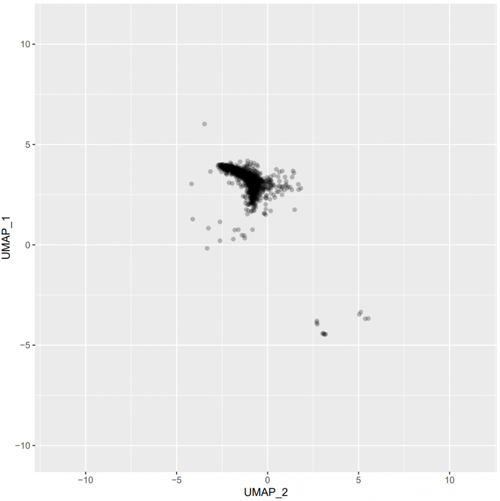
Figure 14 – Plot showing UMAP parameters of a given cluster for all the cells of the dataset (click on the image to open in fullscreen).
9.5) Export clusters-associated heatmaps
It is also possible to export heatmaps showing the clusters phenotypes (by marker) and abundances (by group or by sample) (see Figures 15-16 below):
# Export clusters-associated heatmap (phenotypes by marker)

# Note: If you followed the hierarchical clustering + k-nearest neighbors approach for cell clustering (as detailed in the subsection 9.2.1) of this tutorial), then you already have set the `thresholds` variable and you can directly run the following code.

# On the contrary, you have to set the `thresholds` argument to `NULL`. This will prevent the binary heatmaps (which use these thresholds) from being generated.

clustersPhenotypesHeatmap(
    prefix = prefix_value,
    thresholds = thresholds,
    metricUsed = metricToUse_value,
    datasetFolder = datasetToUse_value
)

# Export clusters-associated heatmap (percentages by group)

clustersPercentagesHeatmap(
    prefix = prefix_value,
    metricUsed = metricToUse_value,
    datasetFolder = datasetToUse_value,
    mode = "group"
)

# Export clusters-associated heatmap (percentages by sample)

clustersPercentagesHeatmap(
    prefix = prefix_value,
    metricUsed = metricToUse_value,
    datasetFolder = datasetToUse_value,
    mode = "sample"
)
Figure 15 – Heatmaps showing the row-scaled phenotypes of each determined final cluster (click on the image to open in fullscreen).
If you chose our own clustering method implemented by default in PICAFlow (not FlowSOM nor PhenoGraph), another heatmap will be generated, in parallel to the one presented in the Figure 15. It will contain the same information except that it will be simplified to a « binary heatmap », using the thresholds variable that you set up earlier. If you did not follow our method, then this thresholds variable should be set to NULL, as described in the previous code section.

Figure 16 – Heatmap showing the abundances of each determined final cluster in each group (click on the image to open in fullscreen).
10) Metadata integration and analysis
From here, we can proceed to the integration of metadata to the processed dataset in order to add new information and layers of complexity, which can help to more precisely analyze the clusters and eventually remove outliers if needed (see below).
10.1) Open and merge datasets
Before beginning, please note that all the following process occurs within the output > 8_Analysis directory. It is also mandatory to copy/paste at least one xxx_clustersPercentages.txt file from the output > 7_Clustering directory to the output > 8_Analysis directory, as this file is the basis of this whole section of the workflow. If needed, users can provide more than one text files: this typically happens when more than one antibody panel is used on the same samples.
Please note that these automatically generated xxx_clustersPercentages.txt files contain 2 close but distinct columns: SampleCorrected and Sample. The Sample column contains the original sample name (matching the name of the FCS file), whereas the SampleCorrected column can be manually edited if necessary to eventually correct a typo or change the formatting of the sample names.
First, we have to select which column of the text file actually contains the sample names, then procceed to the text files merging:
# Define the column to use for data merging

sampleNamesColumn_value = "SampleCorrected"

# Open and merge the text files of interest

data = mergeData(
    pattern = "(.*).txt",
    sampleNamesColumn = sampleNamesColumn_value
)
Even if highly recommended in order to benefit from all the features included in PICAFlow, the following 10.2) section is technically optional, as it heavily relies on the importation of metadata associated to the dataset of interest. If one does not have any metadata to use, this 10.2) section is therefore useless. In this case, please proceed to the 10.3) section.
10.2) I have metadata available for my dataset
10.2.1) Metadata integration
Then, we have to copy/paste in the output > 8_Analysis directory an Excel file named metadata.xlsx containing the actual metadata associated to the samples. For instance, if the samples are from human blood, this file will probably contain information about the patients: ID, name, disease, remarks, biological features, gender, etc. This Excel file has to follow a simple format: the first row should contain the column names, and every next row is referring to a single sample. There can be as much columns and rows as desired, but only the rows matching the actual samples will be kept.
For the example dataset provided in this tutorial, you can download and use the associated PICAFlow_test_dataset_metadata.xlsx file. Do not forget to rename it to metadata.xlsx before use!
Concretely, we only have to define the column of the metadata.xlsx file which contains the sample names that will match with the previously defined sampleNamesColumn used in the mergeData() function:
# Define the column to use for metadata merging

mergeColumn_value = "General.Code_Disease_Groups"
replaceColumn_value = NULL

# Merge the data and metadata

data = mergeMetadata(
    data = data,
    mergeColumn = mergeColumn_value,
    replaceColumn = replaceColumn_value
)
Note: the match should be exact between mergeColumn and sampleNamesColumn!
Note 2: the replaceColumn argument can be used to rename sample rows after merging is done. This can be helpful is you have several clinical subgroups for your samples of a given group for instance.
10.2.2) Subset merged data
Next, we subset the obtained merged data to keep only the desired features that will be included in the next UMAP analysis, both at the data level (with columnsToKeepData arugment) and metadata level (with columnsToKeepMetadata argument):
# Define which data and metadata columns to keep

columnsToKeepData_value = "MixB"
columnsToKeepMetadata_value = NULL

# Subset the merged data

dataOut = subsetDataUMAP(
    data = data,
    columnsToKeepData = columnsToKeepData_value,
    columnsToKeepMetadata = columnsToKeepMetadata_value,
    isColumnsToKeepDataRegex = TRUE
)
Please note that the subsetDataUMAP() function does not really delete any column. It rather splits the dataset in a list of 2 elements: one named dataSubset which contains the actual columns of interest, and another named dataRemoved which contains the unwanted columns.
10.2.3) UMAP dimensionality reduction of cell cluster abundances
Then, we can perform a UMAP dimensionality reduction analysis to observe how data cluster at the cell cluster abundance level, with either groups or gender of samples as overlay (see Figures 17-18 below):
# Define UMAP hyperparameters

n_neighbors_value_UMAP = 3
min_dist_value_UMAP = 0.25

# Perform UMAP analysis on subset data and export a plot showing the group overlay

UMAP_clusters(
    data = dataOut,
    n_neighbors_UMAP = n_neighbors_value_UMAP,
    min_dist_UMAP = min_dist_value_UMAP,
    feature = "General.Group",
    suffix = "_allPatients",
    returnUMAPData = FALSE,
    computeUMAP = TRUE,
    seedValue = seed_value,
    plotHighlightedFeatureItems = TRUE
)

# Perform UMAP analysis on subset data and export a plot showing the gender overlay

UMAP_clusters(
    data = dataOut,
    n_neighbors_UMAP = n_neighbors_value_UMAP,
    min_dist_UMAP = min_dist_value_UMAP,
    feature = "General.Gender",
    suffix = "_allPatients",
    returnUMAPData = FALSE,
    computeUMAP = TRUE,
    seedValue = seed_value,
    plotHighlightedFeatureItems = TRUE
)
Note: Users can provide any metadata-associated column name for the UMAP overlay, as long as it represents categorical values.
Note 2: As previously mentioned, users can test several values for min_dist and n_neighbors UMAP arguments, even if this function does not allow to provide more than one value for each parameter.

Figure 17 – Plot showing UMAP parameters of clustered samples overlaid with their respective groups (click on the image to open in fullscreen).

Figure 18 – Plot showing UMAP parameters of clustered samples overlaid with their respective gender (click on the image to open in fullscreen).
10.2.4) Remove outliers (optional)
Note: If your samples made it to this step, it means that they successfully passed standard quality control tests and that their staining do not seem to present any important trouble as compared to the other samples. But, if you really need to, you have the possibility to eventually remove one or more sample(s) from the dataset. Although totally optional, this can eventually become necessary when there are a very important number of batches in your dataset (typically incarnated by the « one sample, one batch » experimental design), or if the associated metadata for some samples are incorrect or not precise enough. The example provided in the tutorial is purely illustrative and do not represent actual biological artifacts. In all cases, please use this feature knowingly.
To try reducing this previously identified heterogeneity, we can choose (or not) to eliminate one or more samples that we identify as outliers (in a purely illustrative way here):
# Define outliers

outliersToRemove_value = c(
    "Group-HD_Sample-BARBIm",
    "Group-RA_Sample-DOMm",
    "Group-SLE_Sample-BARc",
    "Group-Sjogren_Sample-BELk",
    "Group-Cryo_Sample-CHAr"
)

# Remove outliers from the dataset

data = removeOutliers(
    data = data,
    outliers = outliersToRemove_value
)
Then we need to recompute the columns subsetting and the UMAP dimensionality reduction (see Figure 19 below):
# Recompute subset data (as previously)

dataOut = subsetDataUMAP(
    data = data,
    columnsToKeepData = columnsToKeepData_value,
    columnsToKeepMetadata = columnsToKeepMetadata_value,
    isColumnsToKeepDataRegex = TRUE
)

# Perform UMAP analysis on the remaining dataset (as previously)

UMAP_clusters(
    data = dataOut,
    n_neighbors_UMAP = n_neighbors_value_UMAP,
    min_dist_UMAP = min_dist_value_UMAP,
    feature = "General.Group",
    suffix = "_noOutliers",
    returnUMAPData = FALSE,
    computeUMAP = TRUE,
    seedValue = seed_value,
    plotHighlightedFeatureItems = TRUE
)
Figure 19 – Plot showing UMAP parameters of non-outlier samples overlaid with their respective groups (click on the image to open in fullscreen).
If you need to remove other samples, feel free to redo the previous steps starting from the removal of outliers step. If you need to add again a removed sample, please start from the beginning of the chapter 10).
10.2.5) Include final UMAP embeddings to the dataset
Once we are fully satisfied with the remaining data, we include the latest computed UMAP embeddings to the columns of interest of the dataset, which will constitute the final dataset to use in the last parts of the workflow:
# Include final UMAP embeddings to the dataset

dataOut = UMAP_clusters(
    data = dataOut,
    n_neighbors_UMAP = n_neighbors_value_UMAP,
    min_dist_UMAP = min_dist_value_UMAP,
    feature = "General.Group",
    suffix = "_noOutliers",
    returnUMAPData = TRUE,
    computeUMAP = TRUE,
    seedValue = seed_value,
    plotHighlightedFeatureItems = TRUE
)
10.2.6) Hierarchical clustering of UMAP projection
Next, we can perform a hierarchical clustering analysis based on previously generated UMAP embeddings and export the associated plot (see Figures 20-21 below):
# Define a number of clusters to export

clustersNb_value = 3

# Perform a hierarchical clustering of the dataset UMAP projection

dataOut = hierarchicalClusteringData(
    data = dataOut,
    clustersNb = clustersNb_value
)

# Perform UMAP analysis on dataset and export a plot showing the clusters overlay

UMAP_clusters(
    data = dataOut,
    n_neighbors_UMAP = n_neighbors_value_UMAP,
    min_dist_UMAP = min_dist_value_UMAP,
    feature = "cluster",
    suffix = "_noOutliers",
    returnUMAPData = FALSE,
    computeUMAP = FALSE,
    seedValue = seed_value,
    plotHighlightedFeatureItems = TRUE
)
Figure 20 – Dendrogram showing the number of desired sample clusters (click on the image to open in fullscreen).

Figure 21 – Plot showing UMAP parameters of non-outlier samples overlaid with their respective clusters (click on the image to open in fullscreen).
You can see in the Figure 21 above that patients are separated in 3 well-defined clusters. Here, the chosen number of clusters was purely illustrative, but users can actually define it to any number they want. The hierarchical clustering approach will output this chosen number of clusters, so users have to perform iterative tests to determine the optimal number of clusters for their dataset.
These clusters could for instance help users to study differences between previously unthought patient groups (for instance, cluster 1 vs. cluster 2, or cluster 1 vs. cluster 3, or cluster 2 vs. cluster 3 in our example).
10.2.7) Prepare data for export
One of the last steps is to restructure the cell cluster abundances matrix to have a simple table containing all the associated metadata columns (and not only the ones of interest used for the UMAP dimensionality reduction):
# Restructure the data to merge all the columns of interest

dataBind = bindData(
    data = dataOut
)
10.2.8) Export merged data, boxplots and feature tables
Then, we choose columns that we want to plot as histograms/boxplots according to one or more feature(s) of interest to split the dataset by. Using these information, we finally construct the associated plots (see Figure 22), then export the final matrix as a table as well as other tables (one per feature of interest) containing several statistics about cell clusters (notably their abundances according to the separating feature, statistical comparison between every possible pair, etc.):
# Define features and columns to use

featuresToUse_value = c(
    "General.Group",
    "cluster",
    "General.Gender"
)

columnsToPlot_value = colnames(dataOut$dataSubset)

# Construct boxplots and UMAP overlays for the previously defined values

constructPlots(
    data = dataBind,
    columnsToPlot = columnsToPlot_value,
    features = featuresToUse_value,
    plotUMAPOverlays = TRUE
)

# Export the full data table

exportDataBind(
    data = dataBind
)

# Export feature tables

exportFeaturesTables(
    data = dataBind,
    columnsToUse = columnsToPlot_value,
    featuresToUse = featuresToUse_value,
    metricToUse = metricToUse_value
)
Figure 22 – Boxplots showing a given cluster abundance for the feature « group » (click on the image to open in fullscreen).
Furthermore, we can export several heatmaps showing the clusters abundances according to the different features of interest (see Figure 23 below):
# Export heatmaps showing clusters abundances according to the feature of interest

# Feature = "Group"

heatmapAbundancesGroups(
    feature = "General.Group",
    clustersToKeepRegex = "MixB",
    metricToUse = metricToUse_value
)

# Feature = "Gender"

heatmapAbundancesGroups(
    feature = "General.Gender",
    clustersToKeepRegex = "MixB",
    metricToUse = metricToUse_value
)

# Feature = "Cluster"

heatmapAbundancesGroups(
    feature = "cluster",
    clustersToKeepRegex = "MixB",
    metricToUse = metricToUse_value
)
Figure 23 – Heatmap showing the abundances of each determined cluster in each feature « group », without the presence of outliers (click on the image to open in fullscreen).
10.2.9) ROC analysis
Ultimately, we can also perform ROC analyses on the dataset by defining a list of predictors to use and a list of pairs of groups to analyze. Please note that the following function needs an Excel file of any desired name (specified in the dataFile argument of the ROCanalysis() function) in the output > 8_Analysis directory.
Please note that this Excel file should be generated based on the FullData.txt file previously generated by the exportDataBind() function.
# If necessary, recall the clusters present in the dataset with one of the following commands

colnames(dataBind)
colnames(dataBind[, grep(columnsToKeepData_value, colnames(dataBind))])

# Define parameters to use for ROC analysis

predictorsList = list(
    c(
        "MixB_C328",
        "MixB_C296",
        "MixB_C139"
    )
)

pairsToAnalyzeList = list(
    list(
        c("HD", "SLE", "RA", "Sjogren"),
        c("Cryo")
    )
)

# Perform ROC analysis

ROCanalysis(
    dataFile = "FullData_custom.xlsx",
    predictors = predictorsList,
    pairsToAnalyze = pairsToAnalyzeList,
    pairs_columnToCheck = "General.Group"
)
Please note that each predictorsList element can also be a vector, meaning that it can contain several items. In this case, the final predictor used for the ROC computation will be automatically defined as the sum of the indicated subpredictors. More information about this function is available in the associated documentation (?ROCanalysis).
Please note that the provided cluster name in the previous script (MixB_C102 here) may not actually be present in the clustering when you perform it, due to the initial randomness of the clusters’ generation.
The choice was made here to rely on a manually-edited Excel file because users could need to create new predictors for their dataset, which can be for instance the sum of several cell clusters, or even an ad-hoc score generated by any method of interest.
Associated ROC curves (see Figure 24 below) and summary table will be saved in the output > 8_Analysis > ROC directory.

Figure 24 – ROC curve showing the impact of a given cluster abundance on selected groups classification (click on the image to open in fullscreen).
10.3) I do not have metadata available for my dataset
Even if one does not have any available metadata related to its dataset, PICAFlow still offers the possibility to perform some minimal operations without any imported metadata, and notably export boxplots showing the abundances of each cluster of interest, split by any feature of interest present within the dataset.
To do this, users can run the following commands:
# Define variables that will not be used anymore to `NULL`

maxCellsPerPlot_value = maxCellsPerPlot_value
sampleNamesColumn_value = sampleNamesColumn_value
mergeColumn_value = mergeColumn_value
columnsToKeepData_value = columnsToKeepData_value
columnsToKeepMetadata_value = columnsToKeepMetadata_value
n_neighbors_value_UMAP = n_neighbors_value_UMAP
min_dist_value_UMAP = min_dist_value_UMAP
outliersToRemove_value = outliersToRemove_value
clustersNb_value = clustersNb_value

# Generate a new column with the actual group of each sample

data$group = gsub("Group-(.+)_Sample-(.+)", "\\1", rownames(data))

# Define which columns to plot and which columns to use as features to split by

columnsToPlot_value = colnames(data)[grep(prefix_value, colnames(data))]
featuresToUse_value = c("group")

# Construct boxplots without UMAP overlays for the previously defined values

constructPlots(
    data = data,
    columnsToPlot = columnsToPlot_value,
    features = featuresToUse_value,
    plotUMAPOverlays = FALSE
)
11) Parameters export
Finally, we want to export all the parameters used throughout the PICAFlow workflow to keep a trace of what we did:
# Export all the parameters used throughout the analysis

parametersToExport = list(
    datasetToUse_value = datasetToUse_value,
    seed_value = seed_value,
    parametersToKeep = parametersToKeep,
    customNames = customNames,
    warpSet_value = warpSet_value,
    gaussNorm_value = gaussNorm_value,
    max.lms.sequence = max.lms.sequence,
    samplesToDelete = samplesToDelete,
    parametersToKeepFinal = parametersToKeepFinal,
    downsampleMinEvents_value = downsampleMinEvents_value,
    maxCellsNb = maxCellsNb,
    estimateThreshold_value = estimateThreshold_value,
    trainingDatasetProportion_value = trainingDatasetProportion_value,
    min_dist_value = min_dist_value,
    n_neighbors_value = n_neighbors_value,
    subsetDownsampled_value = subsetDownsampled_value,
    clusterMinPercentage_value = clusterMinPercentage_value,
    metricToUse_value = metricToUse_value,
    cutoff_value = cutoff_value,
    parametersToUseThresholds = parametersToUseThresholds,
    folder_value = folder_value,
    prefix_value = prefix_value,
    maxCellsPerPlot_value = maxCellsPerPlot_value,
    sampleNamesColumn_value = sampleNamesColumn_value,
    mergeColumn_value = mergeColumn_value,
    columnsToKeepData_value = columnsToKeepData_value,
    columnsToKeepMetadata_value = columnsToKeepMetadata_value,
    n_neighbors_value_UMAP = n_neighbors_value_UMAP,
    min_dist_value_UMAP = min_dist_value_UMAP,
    outliersToRemove_value = outliersToRemove_value,
    clustersNb_value = clustersNb_value,
    columnsToPlot_value = columnsToPlot_value,
    featuresToUse_value = featuresToUse_value
)

exportParametersUsed(
    parametersToExport = parametersToExport
)
The output text file will be saved in the output directory.
12) Acknowledgements
Please note that the following R packages are used by PICAFlow to perform its own operations:
- Parallelized operations and optimized loops:
parallel,doSNOWandforeach - Flow/mass cytometry-related data handling:
flowCore,flowStatsandflowWorkspace - Plots and heatmaps generation:
ggplot2,ggcyto,gplots,plotlyandcowplot - UMAP computing:
uwot - ROC analyses:
ROCit - Text-based data import:
utilsandreadxl - Addition of interactivity to data transformation:
shiny - Exceptions capture:
attempt - Density peaks identification:
pracma - Cell clustering:
class,FlowSOMandFastPG - Progress bars:
tcltk - Miscellaneous operations:
Biobase,matrixStats,methods,rlangandstats
13) Citation
If you used PICAFlow in your analyses, please cite our Application Note published in the Bioinformatics Advances journal:
- Bioinformatics Advances
- PubMed: 38089110
- DOI: 10.1093/bioadv/vbad177